The Biden administration has run into a brick wall, or at least MAGA lunacy, in its $60 billion funding request for Ukraine. A big part of its problem is that many people are debating this funding with the idea that it requires pulling away money from other important programs or that it will be a huge increase in the nation’s debt. This is not true, but the widespread belief that $60 billion is a large amount of money to the federal government is a major obstacle to getting the request through Congress.
The federal government is projected to spend more than $6.6 trillion this year, which means that the Ukraine funding request will be a bit more than 0.9 percent of the federal budget. If people prefer to see the funding proposal relative to the whole economy, our GDP will be around $28.2 trillion this year, so the Ukraine money will be a bit more than 0.2 percent of GDP. If we want another comparison, we will spend roughly $850 billion on the military in 2024, so the Ukraine request is a bit more than 7.0 percent of the size of the military’s budget.
These, and other, comparisons can help to make the impact of the proposed spending request meaningful to people. As it is, almost no one will ever see a sum anything like $60 billion. The figure likely means almost nothing to most people other than being a really big number. It would probably look pretty much the same to people if we added a zero or took one away, since most people have no reason ever to think about numbers in the billions or tens of billions.
Reporters know that these really big numbers are largely meaningless to the people who see or hear them. Margaret Sullivan, who was at the time the New York Times public editor, had a great column back in 2013 where she strongly argued this point.
The column took the paper to task for writing really big numbers, especially in the context of the federal budget, that were meaningless to almost everyone who read them. David Leonhardt, who was then the Washington editor, strongly agreed, saying that they might as well just write “really big number” instead of putting in the billions, tens of billions, or hundreds of billions. There seemed to be a genuine commitment to expressing these numbers in a context that made them meaningful to readers.
I went out to celebrate that night, expecting a new era of reporting in the NYT, which would likely transform reporting more generally, given the importance of the paper. That new era never came.
We’re seeing the repercussions of that failure now in the debate over Ukraine aid. The opponents of the aid are benefitting enormously by the fact that most people hugely exaggerate the size of the aid relative to the budget or the economy.
To be clear, there are good arguments that can be made against aiding Ukraine and the larger war. The fact that the aid is not depressing U.S. living standards or keeping us from spending on other important programs, does not mean it is a good thing.
But we should be having a debate over its actual merits, with a clear knowledge of how much of a burden sending $60 billion to Ukraine is. That is not the case today, and this reality is almost entirely the media’s fault.
Read More Leer más Join the discussion Participa en la discusión
In prior decades we used to try to restrict the ability of the rich and very rich to buy elections. We have limits on campaign contributions to candidates and political parties. Until the Supreme Court’s 2009 decision in Citizens United case, corporations were prohibited altogether from contributing to politicians and political campaigns.
This is no longer the case. The rich have found ways to largely circumvent campaign funding restrictions with independent campaign committees. And corporations can support whatever candidates or causes they want.
But the problem of money is even worse than it seems. Not only do the rich get to spend as much as they want to advance their interests, they can actually get taxpayer subsidies for pushing their political agenda. Through a loophole in the tax code, they can donate an asset, like shares of stock, that has appreciated in value, and not ever pay tax on the capital gain.
To see how this works, suppose that Elon Musk bought shares of Tesla for $100 million that are now worth $1 billion. If Mr. Musk wanted to contribute $1 billion to his favorite political cause, he could sell these shares and then hand over a check for $1 billion.
However, in this case, he would have to pay capital gains taxes on the $900 million gain ($1 billion sales price, minus the $100 million he paid for the stock). His tax bill in this case would be 20 percent of his gains or $180 million.
But due to a loophole in the tax code, Elon Musk’s accountant can arrange to simply transfer the Tesla stock to the campaign committee. In that situation neither Musk nor the campaign committee ever has to pay taxes on the gain. By reducing his taxes, we have effectively given Elon Musk $180 million to support his favorite political cause.
This clearly does not make sense. Whether or not we think we should be limiting rich people’s ability to use their money to influence politics, it is hard to see an argument that the taxpayers need to subsidize their contributions.
To level the playing field at least a little bit, so that we won’t be subsidizing the political contributions of the rich, Rhode Island Senator Sheldon Whitehouse and California Representative Judy Chu are introducing the End Tax Breaks for Dark Money Act. This bill would eliminate the current loophole in the tax code. If it passes, rich people would simply have to pay their taxes on their income like everyone else, before they make their campaign contributions.
The rich and very rich will not like giving up their special subsidy, but it is hard to see why anyone else would object to this proposal.
Addendum
A reader reminded me that high-income people would also pay a 3.8 percent Medicare surtax on capital gains. Also, many states have their own income tax on capital gains, with California’s being the highest at 13.3 percent. This means I substantially understated the subsidy to the political contributions of the rich. In the example here, If Elon Musk still lived in California, the taxpayer subsidy for his $1 billion contribution would be over $300 million.
Read More Leer más Join the discussion Participa en la discusión
It is not hard to get access to government data on homeownership. You just need an Internet connection, that’s it.
Unfortunately, it seems that cost-cutting or other measures prevent reporters at CNN and the New York Times from getting the data that the Census Bureau publishes quarterly on homeownership rates among young people. They keep telling their audiences that young people will never be able to own a home. This is in spite of the fact that homeownership rates among young people are higher today than in 2019 when they did not constantly run stories about young people not being able to own a home.
Here’s the picture from the Census Bureau.
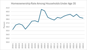
Source: Census Bureau, Table 6.
To be clear, there are some real issues. The homeownership rate among young people is still below what it was before the collapse of the housing bubble and there was a longer-term decline beginning in the late seventies. (This decline is partially concealed in data that looks at homeownership rates among households, since a smaller percentage of young people have their own households today than in the late seventies, since they are still living with their parents.)
The recent run-up in mortgage rates has also made it difficult for many young people to buy a home. If high rates persist, then unless house prices fall, it will be hard for those who do not already own a home to buy one.
However, mortgage interest rates have already fallen, from a peak of over 8.0 percent last fall to around 6.6 percent at present. Most analysts expect further declines, although we are unlikely to see anything like the 3.0 percent rates of the pandemic era.
In any case, it would be dishonest to write as though persistently high rates is a given. No one wrote pieces in 1981 on the impossibility of homeownership based on the assumption that the 18.0 percent mortgage rates of that time would persist indefinitely.
It is not easy for young people to own a home, and that is a problem. But that problem is not new. Perhaps the major news outlets have just discovered this problem, but that is due to their own ignorance, not reality.
It is not hard to get access to government data on homeownership. You just need an Internet connection, that’s it.
Unfortunately, it seems that cost-cutting or other measures prevent reporters at CNN and the New York Times from getting the data that the Census Bureau publishes quarterly on homeownership rates among young people. They keep telling their audiences that young people will never be able to own a home. This is in spite of the fact that homeownership rates among young people are higher today than in 2019 when they did not constantly run stories about young people not being able to own a home.
Here’s the picture from the Census Bureau.
Source: Census Bureau, Table 6.
To be clear, there are some real issues. The homeownership rate among young people is still below what it was before the collapse of the housing bubble and there was a longer-term decline beginning in the late seventies. (This decline is partially concealed in data that looks at homeownership rates among households, since a smaller percentage of young people have their own households today than in the late seventies, since they are still living with their parents.)
The recent run-up in mortgage rates has also made it difficult for many young people to buy a home. If high rates persist, then unless house prices fall, it will be hard for those who do not already own a home to buy one.
However, mortgage interest rates have already fallen, from a peak of over 8.0 percent last fall to around 6.6 percent at present. Most analysts expect further declines, although we are unlikely to see anything like the 3.0 percent rates of the pandemic era.
In any case, it would be dishonest to write as though persistently high rates is a given. No one wrote pieces in 1981 on the impossibility of homeownership based on the assumption that the 18.0 percent mortgage rates of that time would persist indefinitely.
It is not easy for young people to own a home, and that is a problem. But that problem is not new. Perhaps the major news outlets have just discovered this problem, but that is due to their own ignorance, not reality.
Read More Leer más Join the discussion Participa en la discusión
A Delaware state court judge ruled that the $56 billion pay package awarded to Elon Musk by Tesla’s board of directors in 2018 was illegal. The gist of the ruling was that the board was composed of people who were close friends or relatives of Musk. The judge ruled that they gave him an outlandish compensation package, based on targets that they knew would be easily reached. She therefore threw out the contract.
To get an idea of the size of the pay package, Elon Musk’s compensation came to 89 percent of Tesla’s gross (pre-tax) profits over the years 2019-2023. It seems unlikely that that the company could not have attracted a competent CEO who would have agreed to work for a sum substantially less than 90 percent of the company’s profits. It is also seems likely that if an independent board had offered Musk a contract for 1-2 percent of the current contract ($560 million to $1,120 million) that he would have taken it, since it is unlikely that he had better paying options.
It is worth noting that the contract was not thrown out for moral reasons – the judge did not indicate that she felt Musk was making too much money in a general philosophical sense. It was thrown out because the judge determined that a board closely controlled by the CEO was ripping off shareholders with his generous compensation package.
Although most boards are not as tightly controlled by a CEO as Tesla’s, boards generally view their allegiances as being first and foremost to top management and not to shareholders. This is a main cause of outlandish CEO pay.
Last fall, when the UAW negotiated new contracts with the Big Three, it was striking how out of line CEO pay at the U.S. companies was compared with their counterparts in other wealthy countries. The pay of the top execs at Stellantis, Ford, and GM was $21 million, $25 million, and $29 million, respectively. By contrast, at BMW, Mercedes, and Porsche, it was $5.6 million, $7.5 million, and $7.9 million. At the large Japanese manufacturers, it was $2.3 million at Honda, $4.5 million at Nissan, and $6.7 million at Toyota.
It would be difficult to claim that the fact that, GM’s CEO got more than five times the pay of BMW’s CEO, and more than ten times the pay of Honda’s CEO, is explained by superior performance. Clearly the issue is different rules and norms of corporate governance that restrain CEO pay in other countries more than in the United States.
If we looked to change the rules of corporate governance, to give more control to shareholders, it is likely that we can bring pay of CEOs here more in line with their pay elsewhere in the world. This is a big deal, not just because a small number of CEOs get outlandish pay, but because the pay of CEOs distorts the pay structure at the top more generally.
If CEOs got $3 million or $4 million, rather than $20 million or $30 million, the CFO and other top execs would see corresponding cuts in pay, as would third tier executives. This would also spill over into the non-corporate sector. Currently, university presidents or heads of major foundations and charities often get paid $2 million or $3 million a year. When a senior person in the corporate takes a top-level government position at $200,000 a year, that is considered a major sacrifice.
We would be in a very different world if pay for CEOs in the U.S. looked more like pay in Europe and Japan. Elon Musk’s outlandish pay package shows us the route to getting there. It is fine to complain about the morality of CEOs getting $20 million or $30 million or even more, but the more practical issue is that they are ripping off the companies they work for.
If shareholders had more ability to challenge CEO pay, it is likely that we would see serious downward pressure on the size of pay packages CEOs now get. Shareholders have no more interest in CEOs getting two or three times what the market would bear than they do in having assembly line workers or retail clerks getting two or three times the market wage. There is a mechanism in place for restraining the pay of assembly line workers and retail clerks, we need a comparable mechanism for restraining the pay of CEOs and other top management.
Read More Leer más Join the discussion Participa en la discusión
The Washington Post ran a piece by Georgetown University professor Erwin Tiongson telling readers that to find out about the state of the world economy, look at the bottom of toy cars. The point was that toy cars are produced by a relatively simple manufacturing process. The countries that manufacture these cars are likely to have large supplies of relatively low-cost labor.
These countries often are seeing rapid growth as workers are shifting from agriculture to manufacturing, but are not wealthy, since they have large numbers of workers doing cheap labor. The article points out that seventy years ago, it would been common to see these cars produced in the United States. Then they were produced in Japan and Korea. As these countries became wealthier, they were no longer a source for cheap labor, instead China was a likely manufacturer.
With China getting wealthier, and more recently political efforts to reduce dependency on China, Tiongson said that he expected production to move to poorer countries like Mexico, Bangladesh, or Ethiopia. He said that he was surprised to find that many cars were being made in China and also Malaysia.
Tiongson then tells readers:
“In addition, toy manufacturing reflects not only the promise of industrialization but also its disappointments. In late 2022, Mattel commemorated its 40th year of manufacturing in Malaysia by announcing the growth of its Hot Wheels factory there, the world’s biggest. This was a positive development, but Malaysia’s economy reached middle-income status decades ago; in the familiar pattern, it would by now have progressed to manufacturing more complex, profitable products. Instead, the country has remained in what economists Indermit Gill and Homi Kharas defined as the “middle-income trap” — caught between developing and rich nations.”
Actually, the evidence does not indicate Malaysia is in a middle-income trap. Per capita income in Malaysia has continued to catch up rapidly with income in the United States and other wealthy countries, as shown below.
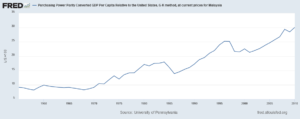
Its current level of per capita GDP is less than 7.0 percent below that of Greece, which would make most people’s list of wealthy countries. It also continues to maintain a rapid pace of growth. The I.M.F. recently projected its growth for 2023 at 4.0 percent, following 8.7 percent growth in 2022. It is projected to continue to grow at roughly a 4.0 percent rate for the rest of the I.M.F. projection period. With population growth of roughly 1.0 percent, this translates into 3.0 percent per capita GDP growth, implying that incomes would double in just over twenty years.
The I.M.F. projections could well prove to be wrong, but they certainly do not support the case for Malaysia being in a middle-income trap. For whatever reason, despite now being a relatively wealthy country, Malaysia is still exporting low-cost manufactured goods. Perhaps looking at the bottom of toy cars doesn’t tell us as much about the world economy as Mr. Tiongson claims.
The Washington Post ran a piece by Georgetown University professor Erwin Tiongson telling readers that to find out about the state of the world economy, look at the bottom of toy cars. The point was that toy cars are produced by a relatively simple manufacturing process. The countries that manufacture these cars are likely to have large supplies of relatively low-cost labor.
These countries often are seeing rapid growth as workers are shifting from agriculture to manufacturing, but are not wealthy, since they have large numbers of workers doing cheap labor. The article points out that seventy years ago, it would been common to see these cars produced in the United States. Then they were produced in Japan and Korea. As these countries became wealthier, they were no longer a source for cheap labor, instead China was a likely manufacturer.
With China getting wealthier, and more recently political efforts to reduce dependency on China, Tiongson said that he expected production to move to poorer countries like Mexico, Bangladesh, or Ethiopia. He said that he was surprised to find that many cars were being made in China and also Malaysia.
Tiongson then tells readers:
“In addition, toy manufacturing reflects not only the promise of industrialization but also its disappointments. In late 2022, Mattel commemorated its 40th year of manufacturing in Malaysia by announcing the growth of its Hot Wheels factory there, the world’s biggest. This was a positive development, but Malaysia’s economy reached middle-income status decades ago; in the familiar pattern, it would by now have progressed to manufacturing more complex, profitable products. Instead, the country has remained in what economists Indermit Gill and Homi Kharas defined as the “middle-income trap” — caught between developing and rich nations.”
Actually, the evidence does not indicate Malaysia is in a middle-income trap. Per capita income in Malaysia has continued to catch up rapidly with income in the United States and other wealthy countries, as shown below.
Its current level of per capita GDP is less than 7.0 percent below that of Greece, which would make most people’s list of wealthy countries. It also continues to maintain a rapid pace of growth. The I.M.F. recently projected its growth for 2023 at 4.0 percent, following 8.7 percent growth in 2022. It is projected to continue to grow at roughly a 4.0 percent rate for the rest of the I.M.F. projection period. With population growth of roughly 1.0 percent, this translates into 3.0 percent per capita GDP growth, implying that incomes would double in just over twenty years.
The I.M.F. projections could well prove to be wrong, but they certainly do not support the case for Malaysia being in a middle-income trap. For whatever reason, despite now being a relatively wealthy country, Malaysia is still exporting low-cost manufactured goods. Perhaps looking at the bottom of toy cars doesn’t tell us as much about the world economy as Mr. Tiongson claims.
Read More Leer más Join the discussion Participa en la discusión
Just as there seems to be a limitless demand for scholarly or pseudo-scholarly pieces that deny global warming, there also is an insatiable demand for pieces that deny the rise in income inequality over the last four decades. The latest entry in this area was an article by Gerald Auten and David Splinter (AS) arguing that income tax data do not show the rise in inequality often claimed.
The main target for Auten and Splinter’s analysis is a series of papers by Thomas Piketty, Emanual Saez, and Gabriel Zucman (PSZ). These papers, also based on income tax data, show a sharp rise in income inequality from 1979 to the present, with the share of the richest one percent going from 13 percent to 19 percent, a rise of six percentage points. (It is worth noting that these numbers exclude income from capital gains, which does not count as income in the GDP accounts.) By contrast, Auten and Splinter find an increase in the share of the top one percent of just one percentage point over this period.
In recent weeks, the Auten and Splinter piece has been highlighted in an article by Dylan Matthews in Vox and a column by Eduardo Porter in the Washington Post. The takeaway from both pieces is that our concerns about inequality have been grossly exaggerated.
Inequality: Income Tax Data and Beyond
There are many differences in the way that AS and PSZ analyze the tax data, but the largest single difference is how they allocate unreported income. (A paper from Brookings, by William Gale, John Sabelhous, and John Thorpe, provides an excellent analysis of the differences between the AS and PSZ studies.) PSZ assume that unreported income is distributed pretty much the same way as reported income. AS relies on I.R.S. audit studies and concludes that a grossly disproportionate share of unreported income goes to the bottom 99 percent of tax filers.
In response, PSZ makes the obvious point that well-hidden income will likely not show up in audit studies. (Remember, these people are committing a crime by not paying taxes they owe. They might need to keep their income hidden to stay out of jail.) Furthermore, the rich will be best positioned to pay for complex and high-cost tax evasion strategies.
But even if there may be some basis for ambiguity in the income tax data, we have other data sources that tell pretty much the same story as PSZ. Most obviously we have the Current Population Survey (CPS) that the Censis Bureau fields every month. This survey top codes income at roughly the cutoff for the richest one percent of the population, so it can’t tell us directly how much income they are receiving. However, it does tell us what 99 percent of the population is receiving.
The CPS also allows us to see the wide gap between productivity and the pay of the median worker that has opened up since 1979. The Labor Department’s monthly survey of employers, the Current Employment Statistics, also shows the same gap.
The Social Security Administration provides an even more comprehensive source of data with its series on annual wages. The great benefit of this data series is that it is not top-coded. An analysis of these data from Elise Gould and Jori Kandra shows an increase in the top 1.0 percent’s share of wage income from 7.3 percent in 1979 to 12.9 percent in 2021, a rise of 5.6 percentage points. This is very close to the 6.0 percentage point rise in the PSZ analysis.
This sort of increase in high-end pay is also consistent with the explosion in the ratio of CEO pay to the pay of ordinary workers. This ratio went from just over 20 to 1 in the 1960s to more than 340 to 1 in 2022. It is worth remembering the exorbitant pay doesn’t go just to the CEO. If the CEO is getting $30 million then the CFO and other top officers are likely getting $10 to $15 million, and even third tier execs can get $1-2 million. The story looks very different if we were back in a world where the ratios were 20 to one, and the CEO might be getting $2 to $3 million a year.
It’s true these series only measure inequality in wage income, but labor compensation is almost 68 percent of total national income. That leaves capital income with just 32.0 percent of the total. You would need some pretty crazy movements towards greater equality in non-wage income to qualitatively change the picture shown in the wage data.
In fact, there has been a modest shift from labor income to capital income with the labor share falling from 71.8 percent in 1979 to 68.0 percent in 2022, the most recent year for which full data are available. Since capital income is more unequally distributed than labor income, this shift would increase the amount of inequality found in the wage data. (Many people wrongly believe that the story of inequality is a shift from wages to profits. In fact, most of the story of inequality over the last four and a half decades has been within the wage distribution.)
In short, the sort of rise in inequality found by PSZ is consistent with the rise in inequality shown in a number of other data sets. There will always be some room for judgment calls in assessing any specific data set, but when they all seem to be going in the same direction, it is difficult to contest the conclusion. We have seen a huge increase in inequality since 1979.
Just as there will always be a market for studies that purport to show that global warming is not happening, there will likely always be a market for analyses that deny the growth in inequality we have seen over this period. While we should always be prepared to question accepted wisdom, it is important to recognize how firm the basis for that accepted wisdom is. In the case of the rise in inequality, it is rock solid.
Read More Leer más Join the discussion Participa en la discusión
We know that it is against the Republican religion for rich people to pay taxes, but many of us didn’t know that CNN was part of the church. It told us loud and clear in an absolutely crazy piece on why baby boomers are not leaving their homes.
The question that article seeks to address is why baby boomers in big houses are not selling them and moving into smaller houses or apartments. The main explanation is taxes.
That might seem implausible on its face, since the federal government exempts the first $500,000 in gains on a house from taxes, and only applies the 20 percent capital gains tax above that. (Actually, almost all households would only pay a 15 percent capital gains rate. The 20 percent rate highlighted in the article applies only to households with income above $550,000, which would be the top one percent of households. However, a huge gain on a house could put someone in this category.)
As a practical matter, very few households will have gains of more than $500,000. If someone bought a home 20 years ago for $200,000 and sold it today for $700,000, they would pay zero tax. And, since this is a marginal rate, if they sold it for $800,000, they would only pay $15,000 in taxes.
It is difficult to believe that a couple that stands to pocket $800,000 from selling their home would be too discouraged by having to pay $15,000 in taxes. Remember also that the taxes only apply to gains after deducting realtor fees and other transactions costs. Also, anyone who has been in their house a long time, the group which is the focus of this piece, has almost certainly paid off their mortgage, so this is all money in their pocket.
The case highlighted in the piece is someone selling a home for $2 million in California, almost two and a half times the median house prices of $830,000 for the state.
“However, if those same $100,000 homebuyers lived for 37 years in an area that has seen enormous growth in home values — as is the case for many parts of California — and their home now sells for 2 million dollars, that’s nearly $1.9 million in profit, of which only $500,000 is excluded from taxes.
“The taxable gain of $1.4 million at 20% would mean those homeowners are facing a $280,000 tax bill. In a state like California with additional tax, the overall payment would be over $450,000.”
It would be reasonable to question even in this case how much of a disincentive the tax would be. After all, even after paying the tax they would be putting $1,550,000 in their pocket (on a $100k investment), a pretty good sum to support their retirement. But the more important point is that CNN is trying to explain what is presumably a large-scale phenomenon, baby boomers staying in big houses they don’t need, based on an example that would almost certainly apply to far less than one percent of this demographic group.
To start with their focus is California, a huge state, but still only 12 percent of the U.S. population. There are few places outside of California where homes have seen any comparable run-up in prices. It is also necessary that people lived in their homes a very long time. Even 20 years ago, the house that sells for $2 million today in California probably sold for $500,000 to $1,000,000, implying far less by way of capital gains.
And, for houses to net a homeowner $2,000,000, after realtor fees and other transactions costs, it would have to sell for around $2,200,000 million. This is close to three times the median price for a house in California.
In short, CNN has used what would have to be an incredibly rare scenario in order to explain what it claims is a widespread problem. That might be useful if you’re trying to scare people about taxes, but it is not good reporting.
Read More Leer más Join the discussion Participa en la discusión
The Washington Post had a piece on how many Black men are not enthusiastic about the economy under President Biden. This is a useful and important piece, since polls show that Black men are not very supportive of Biden. Historically, Blacks have overwhelmingly supported Democratic presidential candidates, if Biden cannot count on winning a large majority of Black votes he will have difficulty getting re-elected.
While it is important for Post readers to see the views of Blacks who are disappointed with Biden, most Blacks do still approve of President Biden’s performance. Many positive aspects of the economy and Biden administration policies have benefited Blacks.
First, and perhaps most important, the unemployment rate for Blacks hit an all-time low of 4.8 percent in April of last year.
In the same vein, the employment rates have been hitting record highs. Low unemployment has also allowed Blacks to make progress in closing the racial pay gap.
Other Biden administration policies have also benefitted Blacks. The number of people enrolled in the Affordable Care Act exchanges has increased by more than five million since President Biden has been in office. Since the exchanges primarily benefit more moderate-income households, it is likely that a large number of Blacks have enrolled in the exchanges since Biden took office, both because he has tried to increase knowledge of the exchanges and made the subsidies considerably more generous.
The Biden administration has also forgiven the student loan debt of almost 4 million people. This has also likely disproportionately benefitted Blacks, since many of the people who had loans forgiven had gone to for-profit schools that were determined to be engaged in predatory activity, collecting tuition for degrees of dubious value. These schools have targeted Blacks and other disadvantaged groups.
Biden also made the income-driven repayment plan for student loan debt far more generous. Under his plan, people making less than $32,500 a year would not have to pay anything towards their debt. There should be few people enrolled in this plan who will find their debt to be a major burden.
Given the large number of Blacks who have materially benefited from the Biden administration’s policies there surely must be some who are enthusiastic about his re-election. It would be useful to present the views of some of these people.
Read More Leer más Join the discussion Participa en la discusión
Perry Bacon’s columns in the Washington Post are generally interesting, and his piece on the future of journalism was no exception. However, after laying out the basic problem, it was almost as though he had a mental block in thinking of solutions.
After noting that for-profit news outlets are going down fast and that the enlightened billionaire model doesn’t seem to work either, Bacon calls on people to donate more money. While it is great that millions of middle-income people are willing to kick in money to support the reporting they like, we are not about to see a massive flood of contributions in response to Bacon’s column.
However, we can hope to change the current structures in place to support journalism. Most importantly, we can look to alter a tax structure where your average billionaire can count on the government to pick up 40 cents of every dollar they choose to donate to the non-profit news outlet of their choice, but the vast majority of ordinary people get zero.
I’m referring to the tax deduction for charitable contributions. To high-income people, this allows them to reduce their taxes by roughly 40 cents for every dollar they donate. Most middle-income people are in the 10 or 12 percent tax bracket, which would mean that they could,d in principle,e get back 10 or 12 cents on every dollar they contributed, but this would only be the case if they itemized their deductions. More than 90 percent of taxpayers take the standard deduction, meaning they get back zero.
This structure is not a law of nature. We change the tax code all the time. Instead of having lavish subsidies for the tastes of the rich, we could have credits that allow ordinary people to decide which news outlets they want to support. For example, we can give every adult citizen $100 a year to support the journalistic outlet of their choosing.
This could be modeled on the current charitable contribution tax deduction. The major difference would be that it is a credit, with the same sum available to everyone, rather than a deduction that almost exclusively benefits the rich.
There would also be another condition. The supported work must be freely available to everyone. That means no paywalls and no copyright monopolies. Copyright monopolies are one way the government has used to support journalism and other creative work for centuries (read Article 1, Section 8 of the Constitution). The logic here is that the government gives you one subsidy, not two. If you want to support your journalism through the tax credit system, you can’t also ask the government to arrest people for reading it without paying you.
A change like this at the national level would require an act of Congress. With the current crew, that seems pretty far-fetched. But we don’t have to rely on Congress to make progress. Measures can be implemented at the state and local levels.
At the moment, there are already two efforts along these lines. One is in Washington, DC, and the other is in Seattle, Washington. Each involves giving city residents a voucher, which can only be used to support local journalism. They are still in their early phases and will undoubtedly have to be extensively debated and restructured before being implemented. These two cities together have less than one percent of the country’s population.
However, if these measures are implemented, they would be important first steps in setting up an alternative mechanism for supporting journalism. People who think journalism is important should be getting on the bandwagon to push these proposals and others like them elsewhere.
Handwringing over the death of journalism might be fun, but it will not solve the problem. Initiatives along these lines have real potential.
Read More Leer más Join the discussion Participa en la discusión
When Donald Trump ran in 2016, he said that if he got elected, we would get tired of winning. When it comes to the economy, it looks like Trump was right, but only after he was out of office for three years.
It would be hard to find a time in the last half century when the economic picture looked so bright. The economy grew 3.1 percent over the last year, a period for which most forecasters were predicting a recession. Unemployment has been below 4.0 percent for 23 consecutive months, the longest stretch since the late 1960s.
Real wages are now rising at a healthy pace with the largest gains going to those at the bottom of the wage distribution. As a result of the tight labor market, workers’ job satisfaction is at a record high. Productivity growth looks like it may be on a higher path. Inflation looks like it has fallen back to the Fed’s 2.0 percent target. And, thanks to the Inflation Reduction Act, we are finally taking some big steps to slow global warming.
This is all really good news that would likely impress most people if they could find out about it, but there is even more. Healthcare costs have stopped rising as a share of GDP and have even declined some in recent years.
The Golden Age of Deficit Hawks
If that doesn’t sound like a big deal to you, then you didn’t live through the Golden Age of Deficit Hawks. Back in the 1990s and through the next decade, the very serious people of both political parties insisted that the deficit and debt were exploding and that they would bankrupt the country if we didn’t do things like cut Social Security and Medicare very soon.
While it was not generally appreciated at the time, most of their projections for fiscal doom were based on projections for exploding healthcare costs. This projected explosion of health care costs was based on exploding private sector healthcare costs. However, this implied huge budget deficits, since the government pays for close to half of all healthcare through programs like Medicare and Medicaid.
If you want to get a taste for these times, read that deficit hawk classic, Will America Grow Up Before It Grows Old: How the Coming Social Security Crisis Threatens You, Your Family, and Your Country, by private equity billionaire Peter Peterson. For more cheap fun, check out the review in the New York Times by a prominent economist (who promptly apologized and owned up to his mistake.)
The Health Care Cost Explosion Didn’t Happen
The deficit hawks have not gone away, but the healthcare cost explosion, which was the basis for their warnings 30 years ago, never came. Healthcare spending as a share of GDP rose from 11.4 percent in 1990 to 13.6 percent of GDP at the end of 1999.[1] It then rose further to 17.3 percent of GDP by 2010.
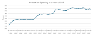
Source: National Income and Product Accounts and Author’s Calculations, see note.
However, since 2010 healthcare spending has changed little as a share of GDP. It was just 17.6 percent of GDP in 2023. In fact, spending in recent years has been down somewhat from its pre-pandemic peak of 18.3 percent in 2016.
The year 2010 is notable because that was the year that Obamacare was passed into law. It would be wrong to claim that Obamacare was the sole reason for the slowing of healthcare cost growth. Costs slowed in most other wealthy countries too. But Obamacare almost certainly contributed to the slowing here.
Also, as a political matter, no one can doubt for a second that if costs had gone the other way, that the Democrats would be held fully responsible for rising healthcare costs. That would be the case even if every other wealthy had a larger increase, a story that we just saw with the pandemic inflation.
Lower Healthcare Costs Are Big Money
Seeing fractions of GDP may hide the amount of money involved in these healthcare cost savings. If we were spending 18.3 percent of GDP on healthcare, as we did in 2016, instead of the current 17.6 percent, that would amount to another $196 billion going to healthcare spending this year. That comes to almost $600 a person or $2,400 for a family of four.
The savings are even larger compared to a scenario where health care costs had continued to grow at their pre-2010 pace. Healthcare spending as a share of GDP rose by 5.9 percentage points between 1990 and 2010. If the share had continued to grow at this pace, healthcare spending would have been 21.4 percent of GDP in 2023, 3.8 percentage points above its current level.
Compared to that benchmark we are saving $1,060 billion a year on healthcare costs. That comes to $3,200 a person in annual savings or $12,800 for a family of four. That is big money by almost any standard.
Hey, Where Are My Savings?
People seeing these calculations can reasonably be complaining that they didn’t see any savings on healthcare. And, in fact they didn’t. These are savings measured against projected cost growth. It turns out that the projections were wrong, whether that was due to good policy or bad projections is not easy to say.
In any case, it’s understandable that people wouldn’t get too excited about savings compared to projections that they know nothing about. It is worth saying here that, at the time, these projections were taken very seriously by people in policy debates across the political spectrum.
If someone debating budget policy in 2010 had substituted the actual course of health care cost growth for the next 13 years, that we now know, in place of the projections being used at the time, they would have been laughed off the stage. We can at least say that we are hugely better off than if the experts had been right in 2010 about the future course of healthcare cost growth.
There are two other important points to be made about these healthcare spending numbers. First, most of us don’t directly pay for most of our healthcare. Most of us have insurance, either through our employer or the government.
While what our employer pays for insurance is reflected to some extent in our pay, and government payments show up in overall spending and deficits, we don’t directly see the healthcare costs we incur. This means that if our employer ends up paying five or ten percent less for insurance, we may never directly see these savings, even if some of the savings do eventually show up in our paychecks.
The other point is a bit tricky. At the end of the day, we don’t really care about buying health care services, we care about our health. No one is happy about having more doctors visits or medical tests, they are happy about being in good health. Most people would be very happy if they could have good health with less medical care.
The question that has to be asked in the context of these savings is whether the quality of care and public health has deteriorated since 2010. There is evidence that public health has gotten worse by some important measures, like life expectancy, in the last 13 years. Anne Case and Angus Deaton documented the rise of “deaths of despair” in the deindustrialized Midwest. However, this rise predates Obamacare. The deterioration in health for a substantial segment of the population can’t in any obvious way be attributed to changes put in place by the Affordable Care Act (ACA).
It is common for people to complain about wait times to see doctors and bureaucratic hoops insurers put patients through in order to get tests or see specialists. While these are bad features of our healthcare system, these problems existed long before the passage of the ACA. It’s possible that they have gotten worse, but few people with serious health issues would have been happy about their dealings with insurers in 2010.
Finally, it is worth noting that even with the slower increases in healthcare cost growth since the ACA was passed, we are still paying almost twice as much per person for our healthcare. And, we have little to show for this extra spending in terms of better outcomes. In short, there is still plenty to complain about with our healthcare system.
Nonetheless, we should be happy for the good news – the projected healthcare cost explosion never came. And, with a bit of luck our healthcare costs may actually come down a bit. Some efforts by the Biden administration, such as reducing drug prices and restraining monopoly power for large insurers and other big actors in the industry, may prove helpful in this respect, but we have a very long way to go to get our costs in line with other wealthy countries.
[1] These numbers are slightly higher than what the Centers for Medicare and Medicare Services (CMS) report for healthcare spending as a share of GDP. They showed a figure of 17.3 percent for 2022 (the last year for which data are available), while my calculations come to 17.5 percent. I assume this is due to some double counting, where I may have some government healthcare spending, which also shows up as consumption. For those wanting to check, I added lines 64, 119, 170, and 273 from NIPA Table 2.4.5U and line 32 from NIPA Table 3.12U. These are therapeutic equipment, pharmaceuticals and other medical products, healthcare services, and net health care insurance. Line 32 is the government spending on Medicaid and other healthcare provision. Although the level is somewhat higher than the CMS data indicate presumably the changes over this period follow the changes as measured by CMS reasonably closely.
When Donald Trump ran in 2016, he said that if he got elected, we would get tired of winning. When it comes to the economy, it looks like Trump was right, but only after he was out of office for three years.
It would be hard to find a time in the last half century when the economic picture looked so bright. The economy grew 3.1 percent over the last year, a period for which most forecasters were predicting a recession. Unemployment has been below 4.0 percent for 23 consecutive months, the longest stretch since the late 1960s.
Real wages are now rising at a healthy pace with the largest gains going to those at the bottom of the wage distribution. As a result of the tight labor market, workers’ job satisfaction is at a record high. Productivity growth looks like it may be on a higher path. Inflation looks like it has fallen back to the Fed’s 2.0 percent target. And, thanks to the Inflation Reduction Act, we are finally taking some big steps to slow global warming.
This is all really good news that would likely impress most people if they could find out about it, but there is even more. Healthcare costs have stopped rising as a share of GDP and have even declined some in recent years.
The Golden Age of Deficit Hawks
If that doesn’t sound like a big deal to you, then you didn’t live through the Golden Age of Deficit Hawks. Back in the 1990s and through the next decade, the very serious people of both political parties insisted that the deficit and debt were exploding and that they would bankrupt the country if we didn’t do things like cut Social Security and Medicare very soon.
While it was not generally appreciated at the time, most of their projections for fiscal doom were based on projections for exploding healthcare costs. This projected explosion of health care costs was based on exploding private sector healthcare costs. However, this implied huge budget deficits, since the government pays for close to half of all healthcare through programs like Medicare and Medicaid.
If you want to get a taste for these times, read that deficit hawk classic, Will America Grow Up Before It Grows Old: How the Coming Social Security Crisis Threatens You, Your Family, and Your Country, by private equity billionaire Peter Peterson. For more cheap fun, check out the review in the New York Times by a prominent economist (who promptly apologized and owned up to his mistake.)
The Health Care Cost Explosion Didn’t Happen
The deficit hawks have not gone away, but the healthcare cost explosion, which was the basis for their warnings 30 years ago, never came. Healthcare spending as a share of GDP rose from 11.4 percent in 1990 to 13.6 percent of GDP at the end of 1999.[1] It then rose further to 17.3 percent of GDP by 2010.
Source: National Income and Product Accounts and Author’s Calculations, see note.
However, since 2010 healthcare spending has changed little as a share of GDP. It was just 17.6 percent of GDP in 2023. In fact, spending in recent years has been down somewhat from its pre-pandemic peak of 18.3 percent in 2016.
The year 2010 is notable because that was the year that Obamacare was passed into law. It would be wrong to claim that Obamacare was the sole reason for the slowing of healthcare cost growth. Costs slowed in most other wealthy countries too. But Obamacare almost certainly contributed to the slowing here.
Also, as a political matter, no one can doubt for a second that if costs had gone the other way, that the Democrats would be held fully responsible for rising healthcare costs. That would be the case even if every other wealthy had a larger increase, a story that we just saw with the pandemic inflation.
Lower Healthcare Costs Are Big Money
Seeing fractions of GDP may hide the amount of money involved in these healthcare cost savings. If we were spending 18.3 percent of GDP on healthcare, as we did in 2016, instead of the current 17.6 percent, that would amount to another $196 billion going to healthcare spending this year. That comes to almost $600 a person or $2,400 for a family of four.
The savings are even larger compared to a scenario where health care costs had continued to grow at their pre-2010 pace. Healthcare spending as a share of GDP rose by 5.9 percentage points between 1990 and 2010. If the share had continued to grow at this pace, healthcare spending would have been 21.4 percent of GDP in 2023, 3.8 percentage points above its current level.
Compared to that benchmark we are saving $1,060 billion a year on healthcare costs. That comes to $3,200 a person in annual savings or $12,800 for a family of four. That is big money by almost any standard.
Hey, Where Are My Savings?
People seeing these calculations can reasonably be complaining that they didn’t see any savings on healthcare. And, in fact they didn’t. These are savings measured against projected cost growth. It turns out that the projections were wrong, whether that was due to good policy or bad projections is not easy to say.
In any case, it’s understandable that people wouldn’t get too excited about savings compared to projections that they know nothing about. It is worth saying here that, at the time, these projections were taken very seriously by people in policy debates across the political spectrum.
If someone debating budget policy in 2010 had substituted the actual course of health care cost growth for the next 13 years, that we now know, in place of the projections being used at the time, they would have been laughed off the stage. We can at least say that we are hugely better off than if the experts had been right in 2010 about the future course of healthcare cost growth.
There are two other important points to be made about these healthcare spending numbers. First, most of us don’t directly pay for most of our healthcare. Most of us have insurance, either through our employer or the government.
While what our employer pays for insurance is reflected to some extent in our pay, and government payments show up in overall spending and deficits, we don’t directly see the healthcare costs we incur. This means that if our employer ends up paying five or ten percent less for insurance, we may never directly see these savings, even if some of the savings do eventually show up in our paychecks.
The other point is a bit tricky. At the end of the day, we don’t really care about buying health care services, we care about our health. No one is happy about having more doctors visits or medical tests, they are happy about being in good health. Most people would be very happy if they could have good health with less medical care.
The question that has to be asked in the context of these savings is whether the quality of care and public health has deteriorated since 2010. There is evidence that public health has gotten worse by some important measures, like life expectancy, in the last 13 years. Anne Case and Angus Deaton documented the rise of “deaths of despair” in the deindustrialized Midwest. However, this rise predates Obamacare. The deterioration in health for a substantial segment of the population can’t in any obvious way be attributed to changes put in place by the Affordable Care Act (ACA).
It is common for people to complain about wait times to see doctors and bureaucratic hoops insurers put patients through in order to get tests or see specialists. While these are bad features of our healthcare system, these problems existed long before the passage of the ACA. It’s possible that they have gotten worse, but few people with serious health issues would have been happy about their dealings with insurers in 2010.
Finally, it is worth noting that even with the slower increases in healthcare cost growth since the ACA was passed, we are still paying almost twice as much per person for our healthcare. And, we have little to show for this extra spending in terms of better outcomes. In short, there is still plenty to complain about with our healthcare system.
Nonetheless, we should be happy for the good news – the projected healthcare cost explosion never came. And, with a bit of luck our healthcare costs may actually come down a bit. Some efforts by the Biden administration, such as reducing drug prices and restraining monopoly power for large insurers and other big actors in the industry, may prove helpful in this respect, but we have a very long way to go to get our costs in line with other wealthy countries.
[1] These numbers are slightly higher than what the Centers for Medicare and Medicare Services (CMS) report for healthcare spending as a share of GDP. They showed a figure of 17.3 percent for 2022 (the last year for which data are available), while my calculations come to 17.5 percent. I assume this is due to some double counting, where I may have some government healthcare spending, which also shows up as consumption. For those wanting to check, I added lines 64, 119, 170, and 273 from NIPA Table 2.4.5U and line 32 from NIPA Table 3.12U. These are therapeutic equipment, pharmaceuticals and other medical products, healthcare services, and net health care insurance. Line 32 is the government spending on Medicaid and other healthcare provision. Although the level is somewhat higher than the CMS data indicate presumably the changes over this period follow the changes as measured by CMS reasonably closely.
Read More Leer más Join the discussion Participa en la discusión