November 12, 2015

November 12, 2015
In his campaign for the Democratic presidential nomination, Vermont Senator Bernie Sanders has made frequent references to Denmark and other Scandinavian countries, which he has held up as models for reforms in the United States. This has resulted in an unusual amount of public interest in these countries, as well as a number of sometimes poorly informed news stories.
These charts are an effort to provide a clearer picture of the economic and social well-being of people in Denmark and the other Nordic countries. It includes most of the standard measures used to assess well-being across countries and compares them to the United States. By most measures these countries appear to be doing quite well, but readers can reach their own conclusions.
Of course, the institutions in these countries cannot simply be transferred to the United States, even if it was desirable. Countries have their own institutional dynamics which cannot simply be wished away. However, it is useful to get a clear picture of these countries just to see whether the systems they have in place seem to be working there.
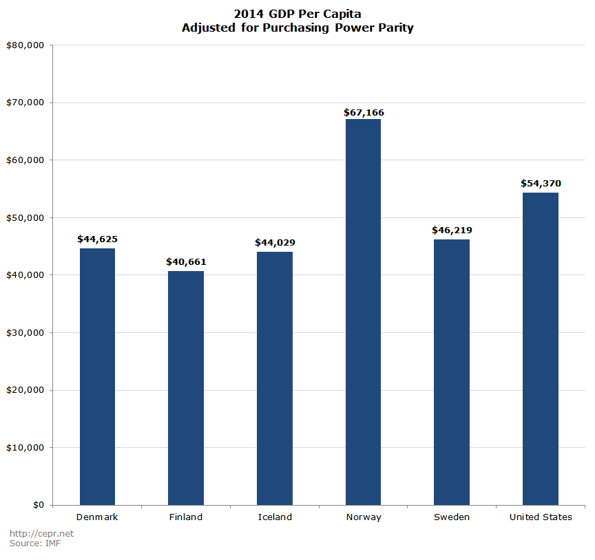
Figure 1 compares GDP per capita in each of the six countries. The data are adjusted for purchasing power parity (PPP), meaning that they take account of different price levels in the various countries. Per capita GDP in Denmark, Iceland, and Sweden is between 80–85 percent of U.S. levels. Norway is considerably richer due to its enormous oil wealth. Finland is somewhat poorer.
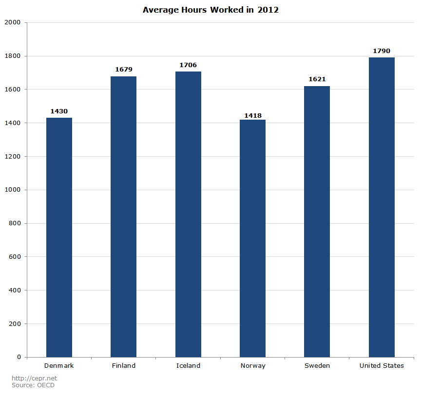
However, at least part of differences in income is due to fact that people in the U.S. work considerably more hours on average. Figure 2 shows the average annual hours worked by workers in each country. In both Norway and Denmark, the average of number of hours worked in a year is over 20 percent less than in the United States. Four to six weeks a year of vacation are standard in these countries. They also grant paid family leave and sick days. The gap in hours with the other countries is somewhat smaller.
The gap in GDP per hour worked is considerably less for most of these countries than the gap in per capita GDP as shown in Figure 3. Denmark’s GDP per hour worked is estimated at being just 5.7 percent less than in the United States.
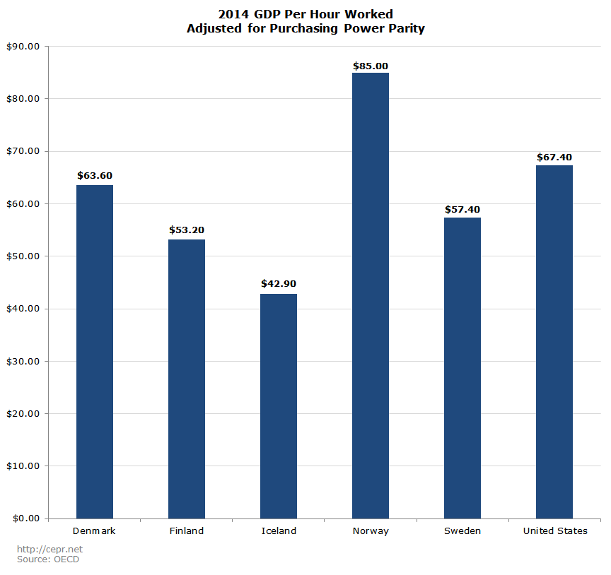
Figure 4 shows 2014 unemployment rates by country. All the Nordic countries except Iceland and Norway had somewhat higher unemployment rates than in the United States. Finland’s unemployment rate is notably higher. The country is having difficulty adjusting to reduced trade with Russia (due to sanctions), the decline in Nokia, and weak demand for paper, a major export. This is in large part due to the fact that it is in the euro, unlike the other countries.
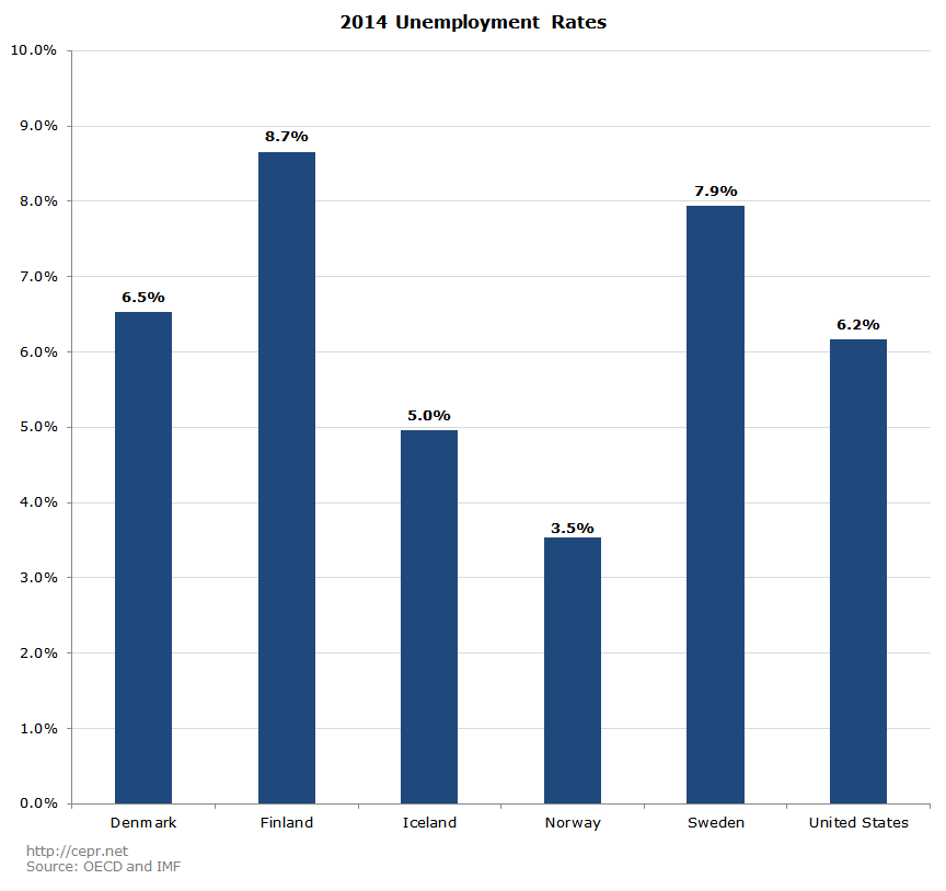
Figure 5 shows the prime-age (ages 25–54) employment rate in each of the five Nordic countries compared with the U.S. The prime-age employment rate is considerably higher in all five countries than in the United States, with the gap between Denmark and the United States being more than five full percentage points. This suggests that the higher unemployment rate in these countries is not attributable to a lack of employment opportunities. Rather, unemployed workers in the Nordic countries tend to continue to look for work and therefore be counted as unemployed. By contrast, in the United States large numbers of prime age workers have given up looking for work.
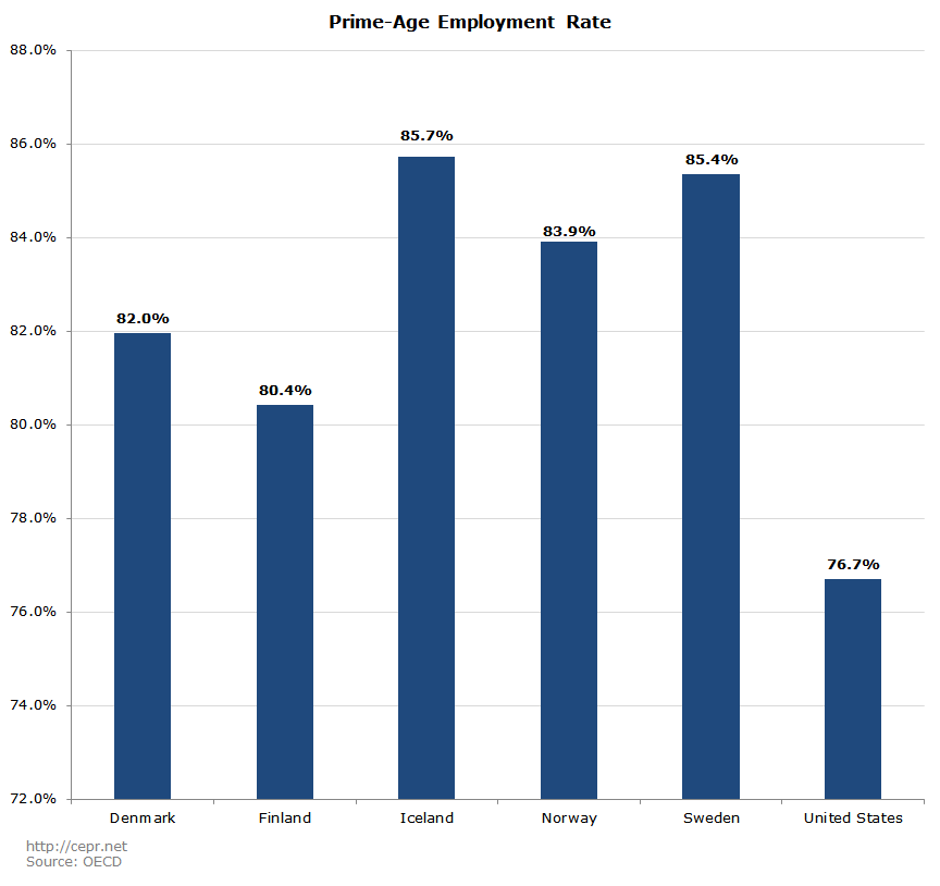
Figure 6 shows employment rates for people aged 55 to 64. All the countries except Finland have higher employment rates among this age group than the United States. The employment rate for people aged 55 to 64 in Iceland is higher than the prime-age employment rate in the U.S.
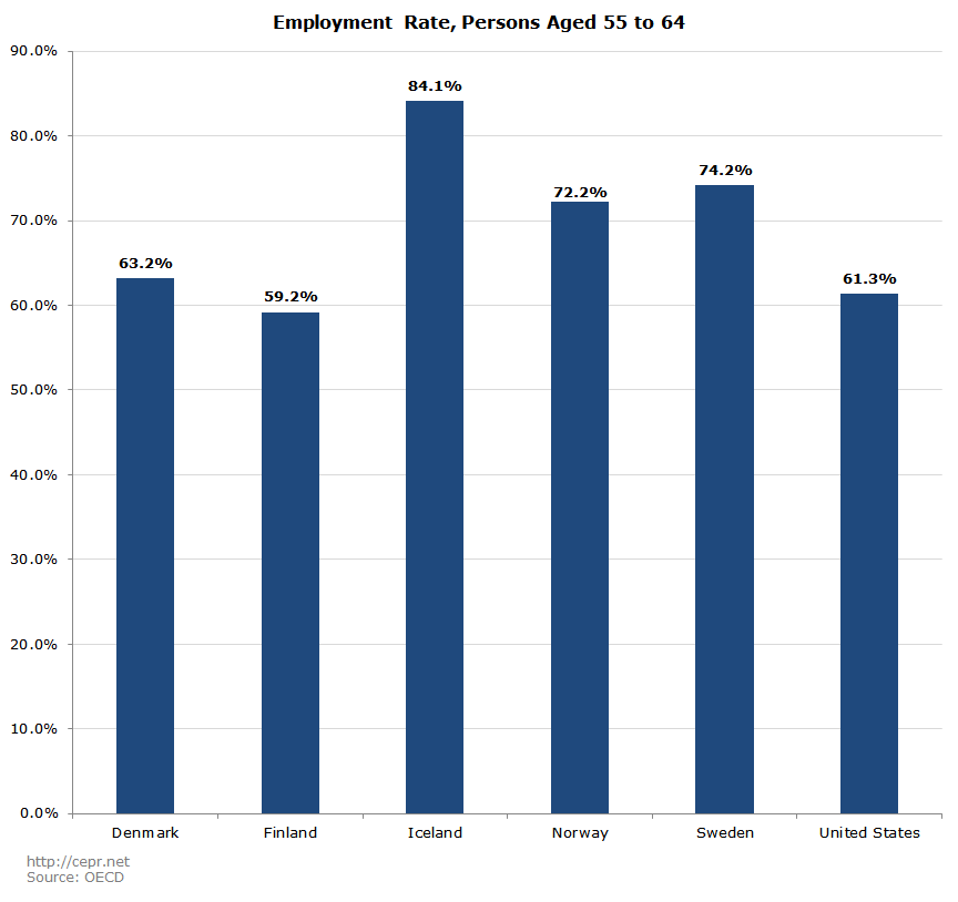
Figure 7 shows the Gini coefficient — the most widely cited measure of income inequality — for persons aged 18 to 65 by country. Inequality is highest in the U.S. both before and after taxes and transfers. With the exception of the United States, there is a perfect correlation between market inequality and the role of fiscal policy in reducing inequality. Countries with greater levels of market income inequality are more proactive at reducing inequality through their tax and spending systems. Notably, while there is a moderate level of variation in terms of market income inequality amongst the Nordic countries, there is very little variation in inequality after taxes and transfers. The after-tax measure of inequality in the United States is higher than the before-tax measure in three of the five Nordic countries.
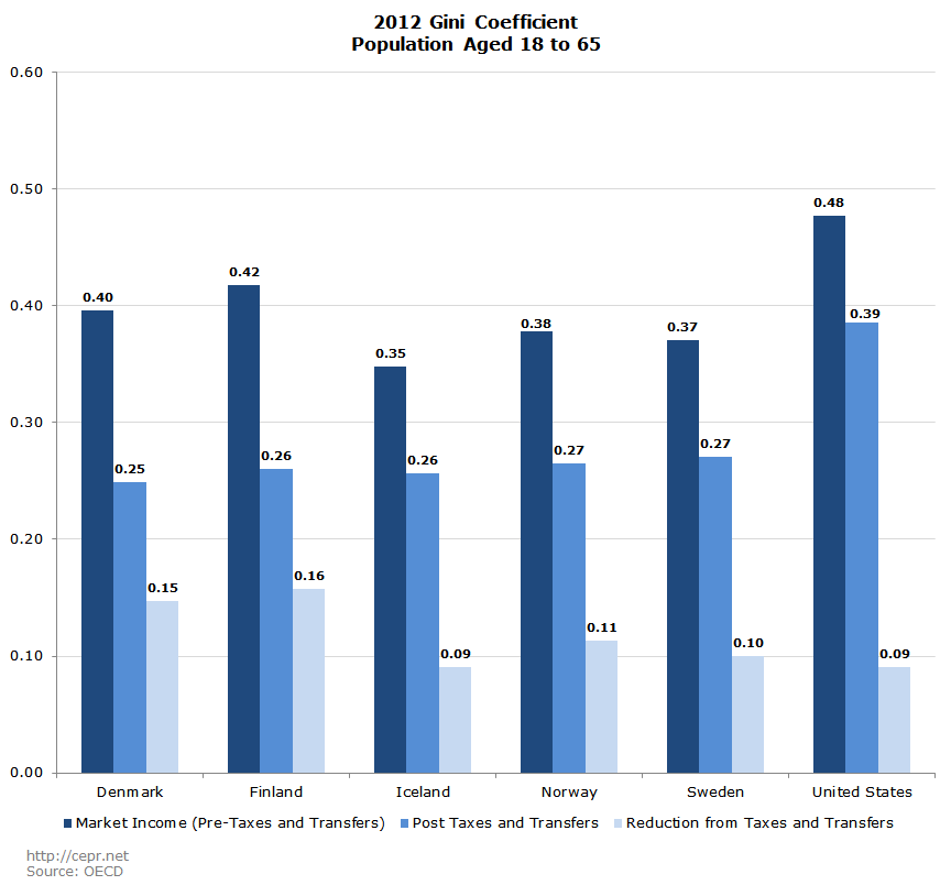
Figure 8 shows the Gini coefficient for the population over the age of 65. The individuals in this sample are mostly retired. Inequality after taxes and transfers is again highest in the United States. The high level of before tax inequality is the result of the fact that many of these people are not working and therefore will have near zero income not counting their Social Security benefits.
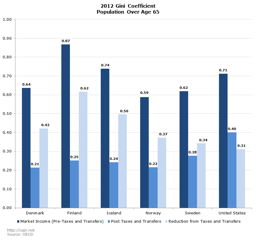
Figure 9 shows one measure of wage inequality — the incidence of low pay — by country. Low pay is defined as less than two-thirds of median earnings. This definition actually understates the difference in earnings inequality between the U.S. and the Nordic countries, as the gap between average and median wages is greatest in the U.S.
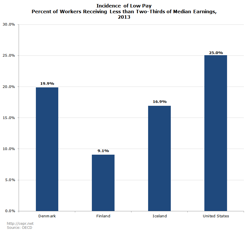
Figure 10 gives the gender wage gap by country, showing the ratio of median women’s pay to the median men’s pay. With the exception of Finland, all the countries have a smaller gap than the United States. In both Denmark and Norway, the median pay of women is more than 90 percent of the median pay of men.
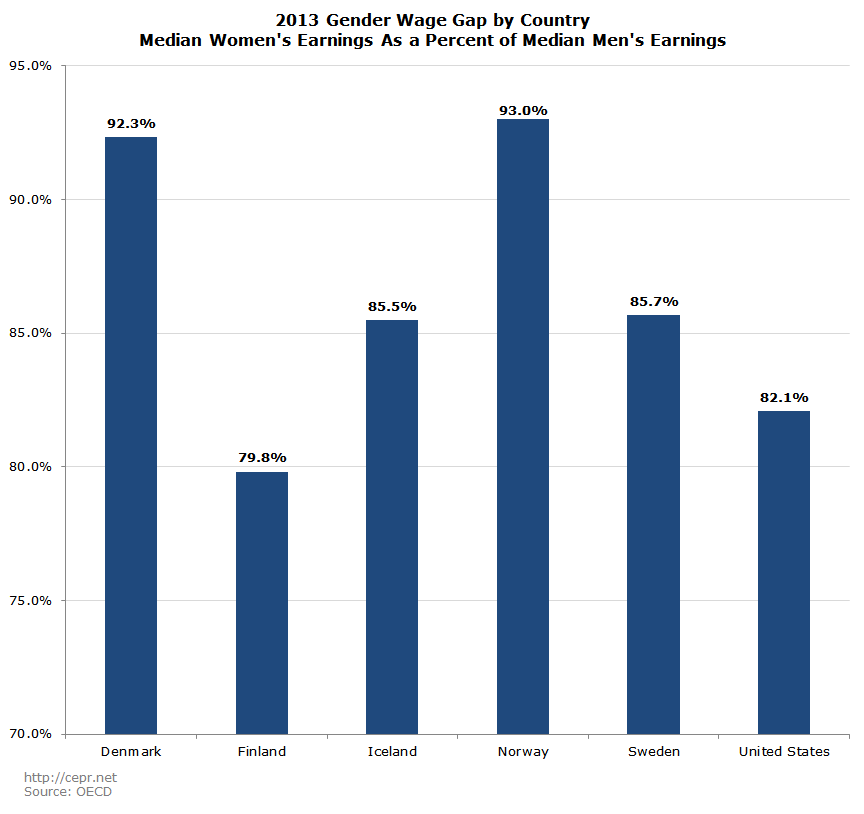
Figure 11 shows the prime-age employment rate for women in 2014. All five countries have substantially higher prime-age employment rates for women than the United States. This is undoubtedly due to many factors, including the accessibility of child care and access to paid leave.
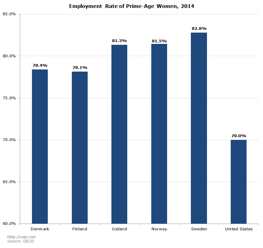
Figure 12 shows each country’s general government budget surplus or deficit as a percentage of GDP for 2014. All five had lower budget deficits in 2014 than the United States. Denmark actually ran a budget surplus of 1.8 percent of GDP, the equivalent of a surplus of $320 billion in the current U.S. economy.

Figure 13 shows net government debt as a percentage of GDP at the end of 2014. Net government debt shows the level of gross government debt minus the government’s financial assets (which can essentially be thought of as “negative debt”). Finland, Norway, and Sweden all have negative net government debt, meaning that their governments’ financial assets are greater in value than their gross debt. In Norway, net government debt is negative 244 percent of GDP. This is due to enormous oil wealth, which it has largely saved for future uses. Denmark’s net debt is just 3.6 percent of GDP, compared to 80.1 percent of GDP in the United States.
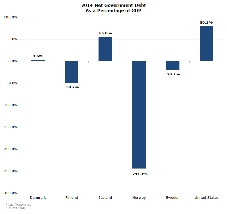
Figure 14 shows each country’s current account balance as a percentage of GDP in 2014. The current account balance is the broadest measure of the trade balance. This can be seen as a basic measure of a country’s international competitiveness, since it measures the rest of the world’s demand for a country’s goods and services relative to its own demand for other country’s goods and services. Four of the five countries had trade surpluses in 2014, with Denmark’s surplus being equal to 6.3 percent of GDP. This would be equivalent to a trade surplus of more than $1.0 trillion in the current U.S. economy. By contrast, the United States had a deficit equal to 2.2 percent of GDP in that year.
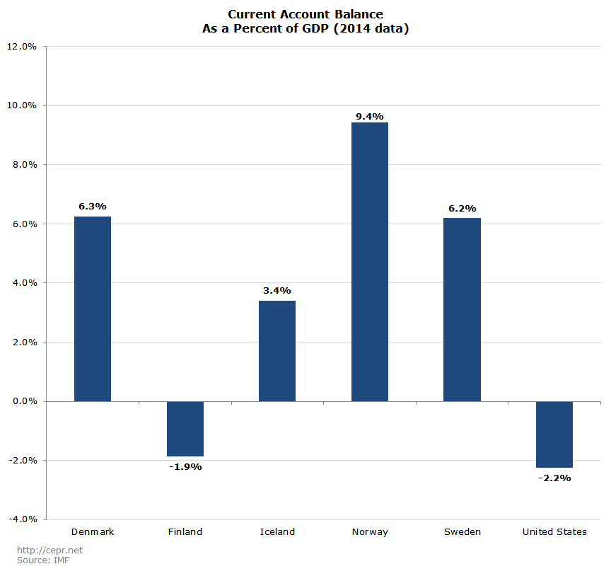
Figure 15 shows per capita energy use by country. Energy use reflects in part the wealth of the country, also its success at conservation measures, as well as natural attributes like the coldness of the climate and the amount of light it receives. The United States uses more energy per person than all of the countries except Iceland. (Iceland has vast amounts of low-cost hydro energy.)
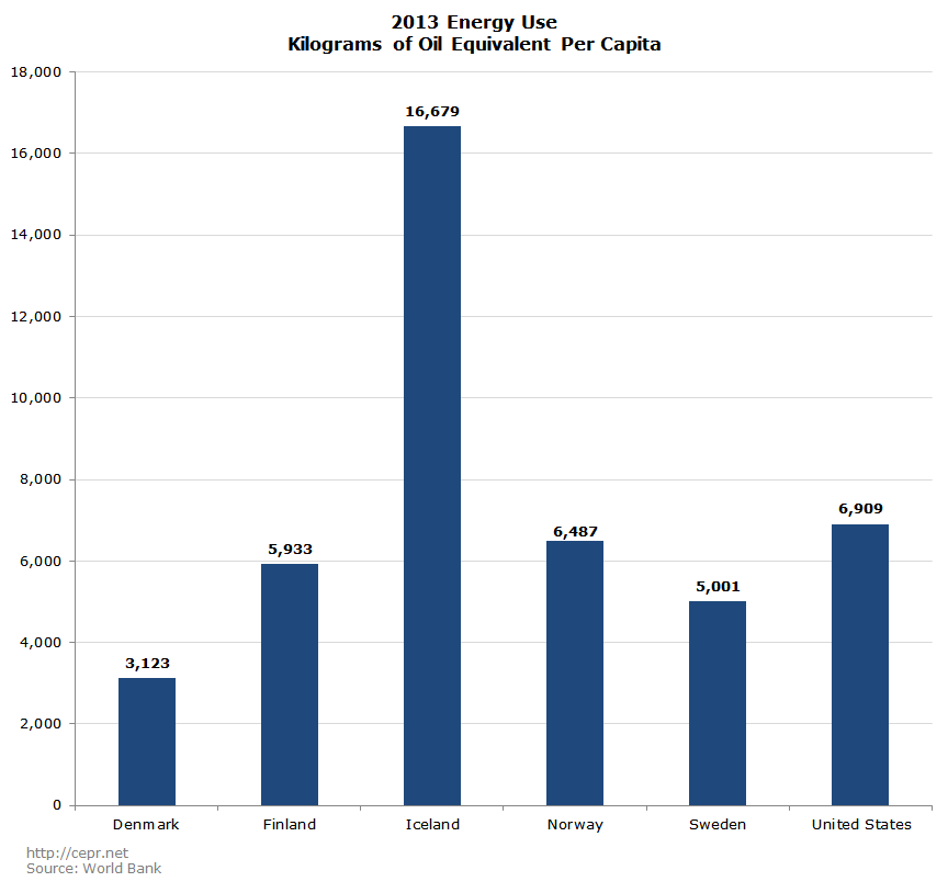
Figure 16 shows the emission of greenhouse gas per capita. All five countries emit far lower per capita emissions than the United States. Per capita emissions in Denmark are just over 40 percent of U.S. levels. This is due to support for clean energy sources and heavy carbon taxes.
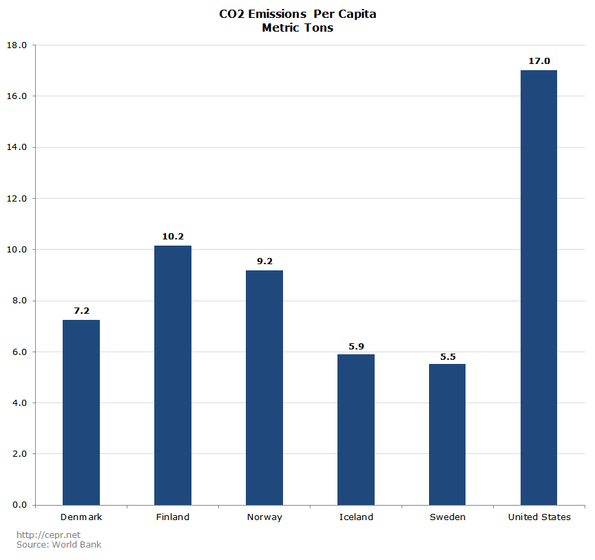
Figure 17 shows school enrollment rates at different levels of education. Denmark is ahead of the United States in enrollment rates at all three levels, with the largest gap at the primary level.
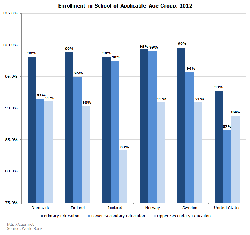
Figure 18 shows the Program for International Student Assessment (PISA) test scores by subject for 15-year-olds, scaled to 100 for the United States. Denmark scores only at U.S. levels in reading and science, but does about four percentage points better on math. The U.S. outperforms Sweden in all three categories. Finland is a world leader in education. It is worth noting that its teachers are almost 100 percent unionized.
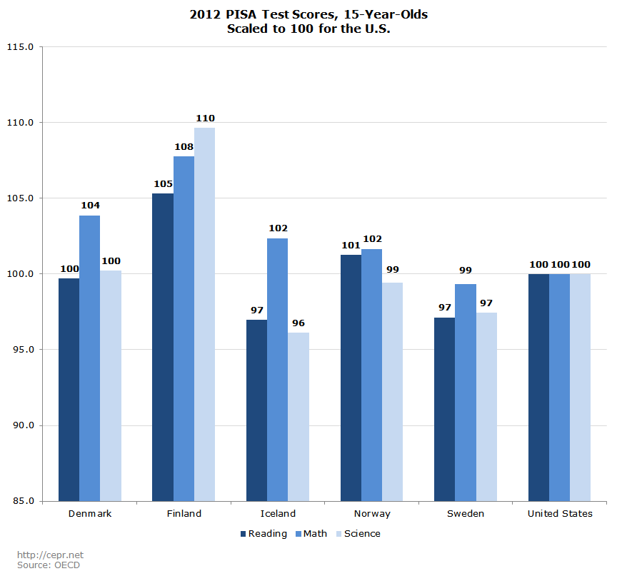
Figure 19 shows healthcare spending as a percentage of GDP in all five Nordic countries and the U.S. The U.S. spends over 17 percent of GDP on healthcare, far higher than what is spent in the Nordic countries (9.1 to 10.6 percent of GDP). Moreover, since GDP per capita is higher in the U.S. than in all the Nordic countries but Norway, there is an even greater discrepancy in terms of PPP-adjusted dollars per capita spent on healthcare.
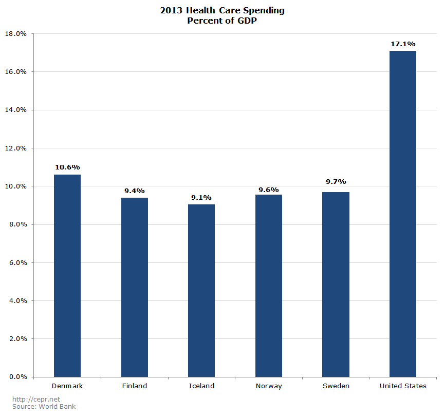
Figure 20 shows life expectancy at birth. People in all five Nordic countries have longer life expectancies than in the United States. Denmark has the smallest advantage at 80.4 years compared to 78.8 years in the U.S.
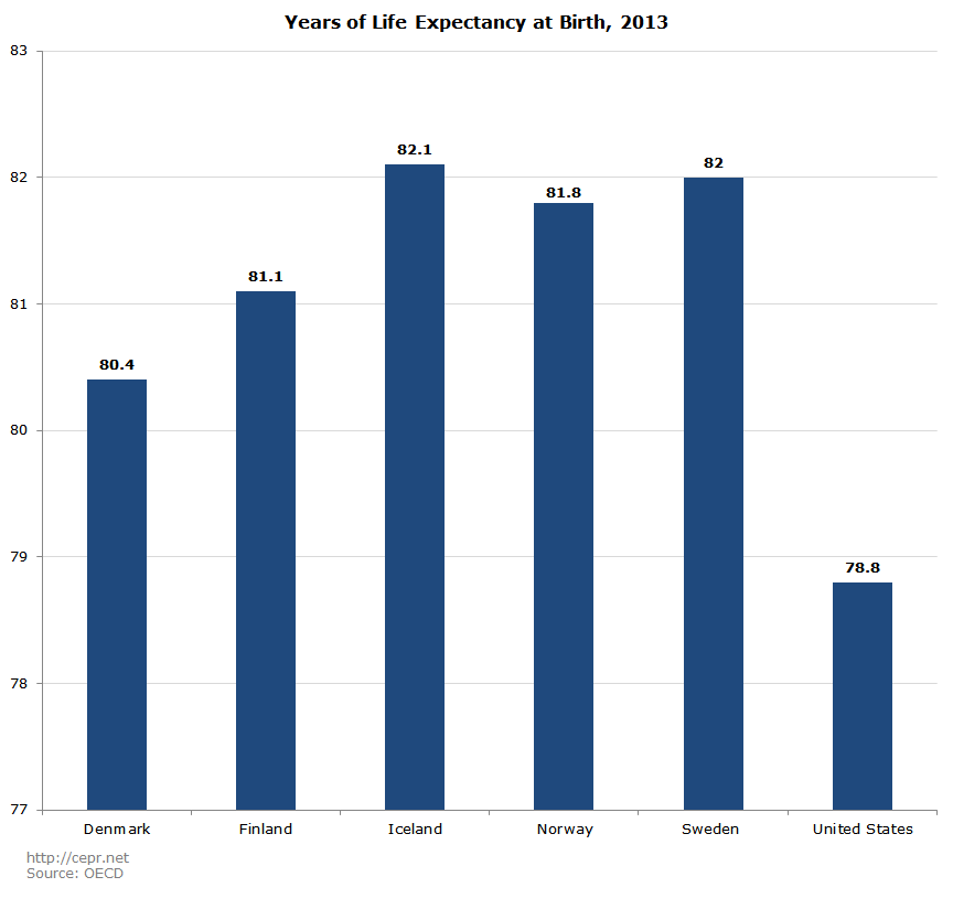
Figure 21 shows life expectancy at age 65. The United States is behind the other four Nordic countries in this category as well, but does edge out Denmark in the life expectancy for both men and women at this age. It is worth noting that the United States has universal health care insurance (Medicare) for people over age 65.
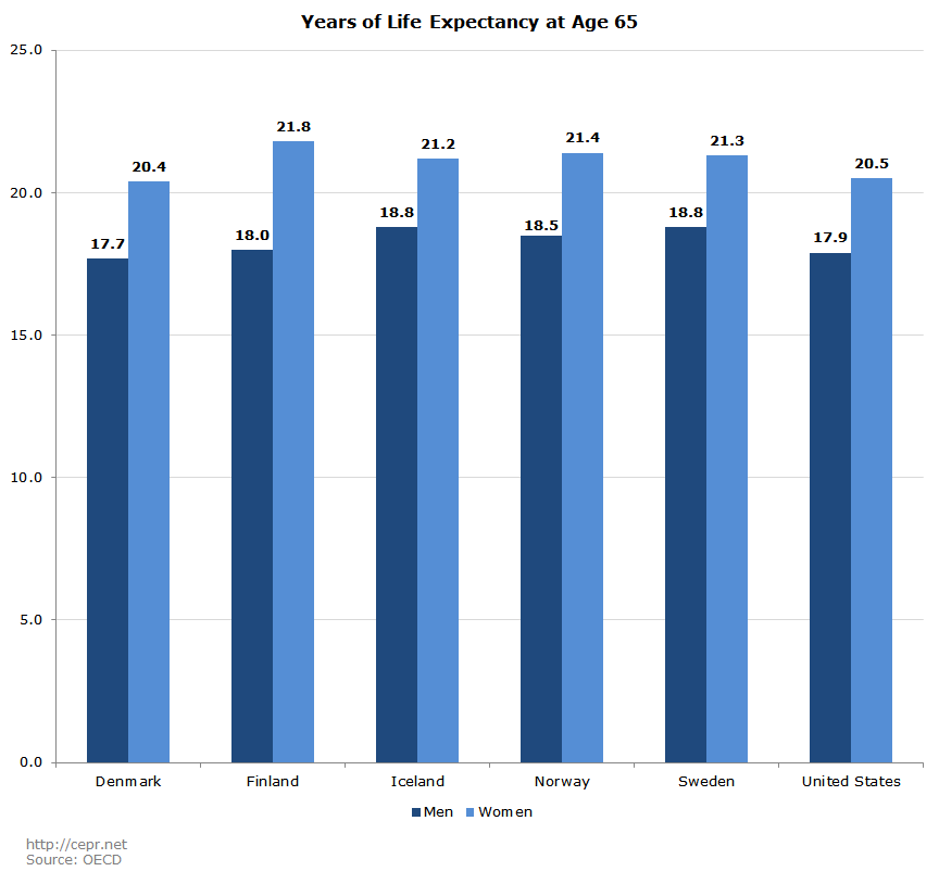
Figure 22 shows infant mortality rates. In the United States, approximately 5.7 out of every one thousand babies die before they are one year old. This is nearly twice the rate in Denmark and more than three times the rate in Iceland.
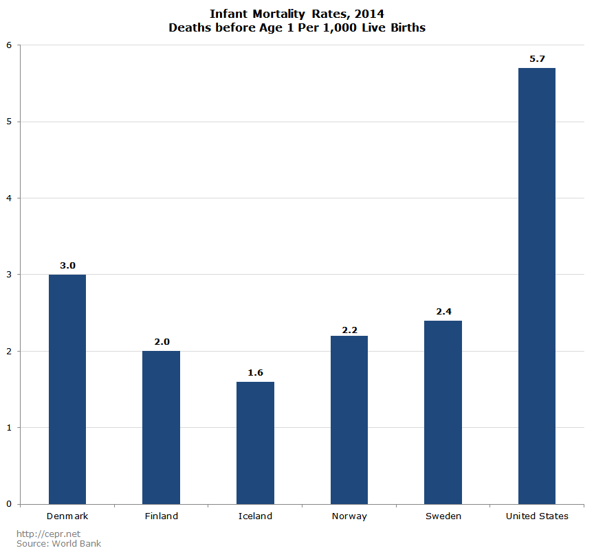
Figure 23 shows the homicide rate in all six countries. Death by homicide is more than twice as likely in the U.S. as in any of the Nordic countries; it is almost six times as frequent as in Denmark.
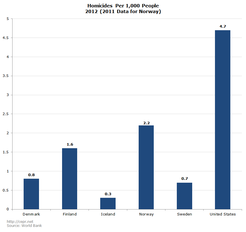
Figure 24 shows each’s country’s incarceration rate. The United States incarcerates a far larger percentage of its population than any of the Nordic countries. More than ten times as large a share of the population is incarcerated in the United States than in Denmark.
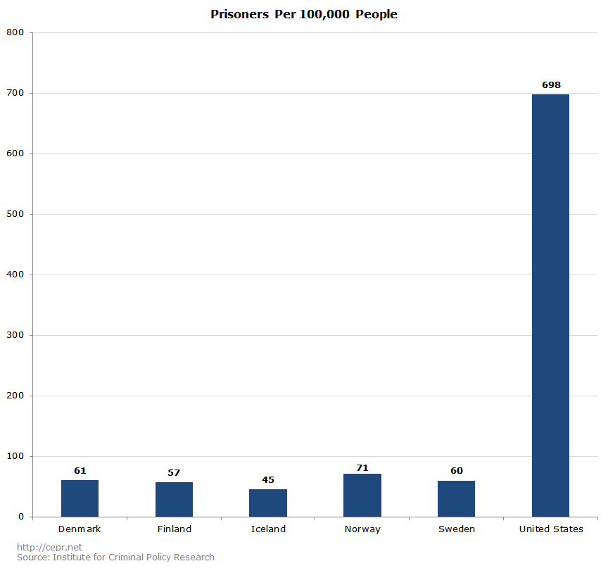
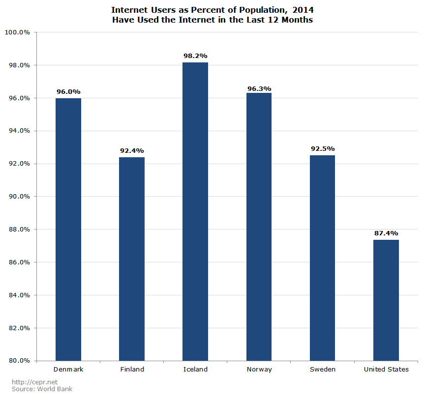
Figure 25 shows the percentage of the population that accessed the internet at some point in 2014. Internet use is lowest in the United States at 87.4 percent and highest in Iceland, where over 98 percent of the population accessed the internet at least once in 2014. Denmark and Norway are both at 96 percent.
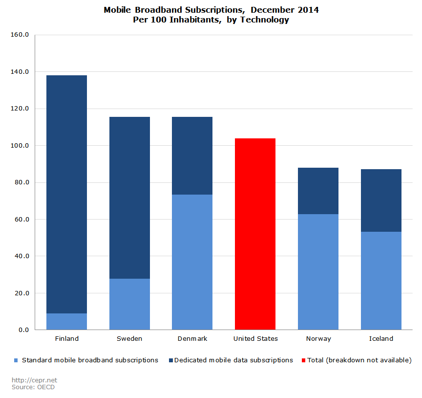
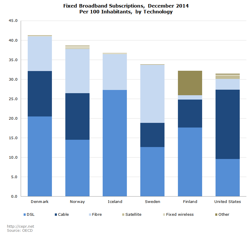
Figures 26 and 27 show the number of mobile and fixed broadband subscriptions per 100 members of the population. The United States scores in the middle of the pack in terms of broadband subscriptions to mobile phones (Figure 26), but scores last in terms of fixed broadband subscriptions (Figure 27). The Danes seem to score the best overall across the two measures with the highest rate of fixed broadband subscriptions and the second highest (tied with Sweden) rate of mobile broadband subscriptions.
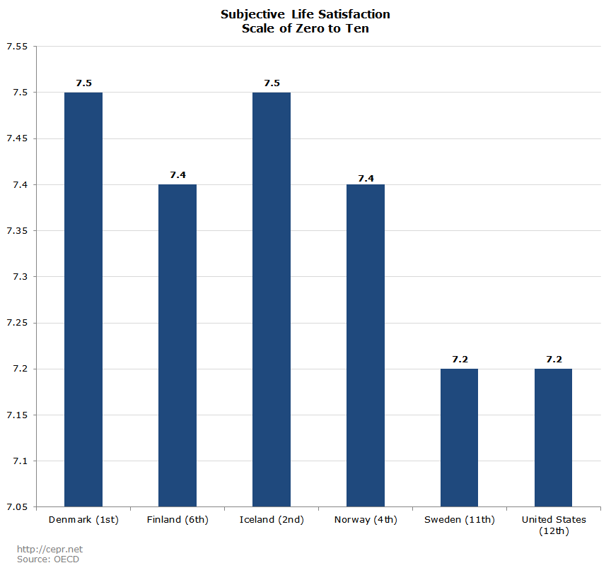
The last measure is a subjective measure of satisfaction from the OECD’s Better Life Index. People in all 36 OECD countries are asked to rate their general satisfaction with life on a scale of one to ten. These six countries – which are relatively wealthy even in comparison with other OECD countries – all scored above-average. Denmark and Iceland, in particular, scored first and second in terms of subjective happiness. The United States tied for last among this group with Sweden, as is shown in Figure 28. It is important to note that a subjective measure of well-being depends at least in part on people’s expectations, but at least people in Denmark and the other Nordic countries do not think of themselves as doing poorly.