Article
Fact-based, data-driven research and analysis to advance democratic debate on vital issues shaping people’s lives.
Center for Economic and Policy Research
1611 Connecticut Ave. NW
Suite 400
Washington, DC 20009
Tel: 202-293-5380
Fax: 202-588-1356
https://cepr.net
This graph by World Bank economist Branko Milanovic made the rounds last week.
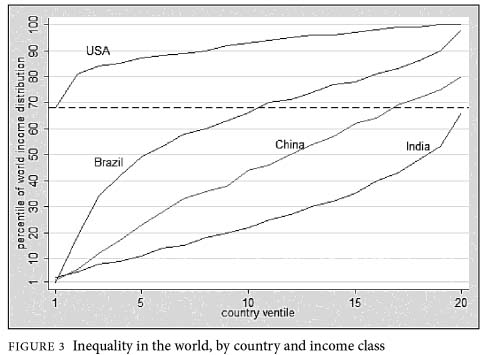
Income ventiles, USA, Brazil, China, and India
Source: Branko Milanovic, The Haves and the Have Nots
To construct the figure, Milanovic first took the population of each of the four countries shown and ordered them from poorest to richest. Then, still within each country, he divided each of the ordered populations into 20 equal sized groups. The bottom group –a “ventile,” for one-twentieth– has the poorest five percent of people in each country. The next ventile has the next-“richest” five percent, and so on, up to the last ventile, which contains the richest five percent of the country’s population.
What is particularly interesting about this graph is that it allows us to compare the average earnings of the various ventiles across the four countries. So, for example, we can see that the average income in the poorest ventile in the United States appears to be higher than the average income of the richest ventile in India. This is an astonishing result and Milanovic, but especially many of the bloggers who covered the graph, make a lot of it.
I do think it is helpful to see just how much inequality there is between countries, even between the bottom and the top in different countries. But, I think it is easy to make too much of this graph, particularly when comparing the bottom of the United States with the top of poor countries like India.
To make the comparison across countries, Milanovic follows the standard procedure used by economists (based on the idea of “purchasing power parity”). Basically, he adjusts incomes to reflect local prices. The procedure is similar in spirit to adjusting incomes over time to reflect differences in prices in 1980, say, and today.
The problem is that the procedures used to make these international price comparisons are fairly crude, and generally aren’t up to the task of measuring the cost of living at the extremes of the income distribution, which is exactly what many people commenting on the graph have focused on.
Yes, the poor in the United States are “rich” by world standards. They generally (though not always) have running water, built dwellings, access to sufficient calories (though not necessarily good nutrition), and so on. But the idea that the poorest residents of Washington, DC, have a standard of living that is as good or better than the average person in the top five percent of the income distribution in Delhi is absurd. The top five percent in Delhi generally have a very nice house (possibly more than one), luxury cars, multiple servants, will travel internationally, go to elite schools, have access to excellent medical care, and so on.
These kinds of differences in cost of living are not well captured, however, by the standard “purchasing power parity” approaches based on the average prices of goods and services in each economy. And not accounting for these hard-to-quantify effects can create big distortions. As Amartya Sen noted in “Development as Freedom”: “…the point is often made that African Americans in the United States are relatively poor compared with American whites, though much richer than people in the third world. It is, however, important to recognize that African Americans have an *absolutely* lower chance of reaching mature ages than do people of many third world societies, such as China, or Sri Lanka, or parts of India (with different arrangements of health care, education, and community relations).” (Emphasis in the original.)
I haven’t read Milanovic’s book, but I have been consistently impressed with his work on international economic inequality, and suspect that this new book is also excellent. I don’t have a problem with the graph. But, it is possible –and wrong– to draw strong conclusions from it about the extremes of the income distributions in the United States, India, and elsewhere.
This article originally appeared on John Schmitt’s blog, No Apparent Motive.