December 22, 2014
The Congressional Budget Office (CBO) recently updated its analysis of changes in before-tax and after-tax family income. In some ways the new analysis showed a brighter picture for middle income families than other work highlighting stagnation. Focusing on the middle quintile of households with children, the new CBO analysis showed a gain in before-tax income of 25.2 percent from 1979. The gain in after-tax, after-transfer income was 46.7 percent. This may not amount to huge gains over a 31-year period, but it is not zero. It is worth looking at these numbers more closely.
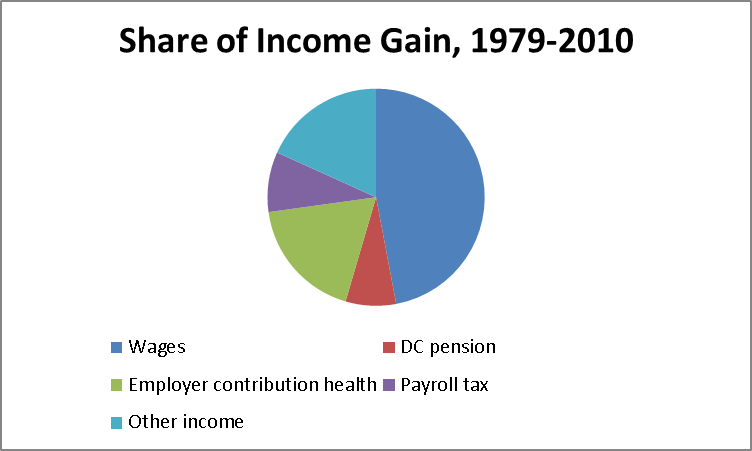
Focusing on the before-tax side, the CBO numbers show income for the middle quintile rising from $61,200 in 1979 to $76,600 in 2010 (in 2010 dollars). By far the biggest single chunk of this increase is wages. According to CBO, wage income for this group rose by 14.3 percent over this period, a 0.4 percent annual rate. This is bit better than what we would see looking at the standard wage data. For example, the Economic Policy Institute (EPI) shows the median hourly wage rising by just 5.6 percent over this period.
It turns out that the difference can be explained entirely by differences in price indices used to deflate earnings. (There are also issues about hours worked, the average work year increased somewhat over this period as more women worked full-time jobs, but it would take a more careful analysis to see how hours changed for families in the middle quintile.) CBO used the PCE deflator, the index used to deflate consumption expenditures by households and spending by non-profit organizations. This shows a rate of inflation that averages 0.24 percentage points less than the CPI-URS used by EPI.
There are differences in the expenditures covered by the two indices, and also some minor methodological differences, but the main reason for the gap is that the PCE deflator allows for substitution. If people change their consumption patterns in response to price changes (for example, buying more cell phones and fewer land lines due to a drop in cell phone prices), the PCE deflator will increase its weight on the item people are buying more frequently (cell phones) and reduce the weight on the item people are buying less frequently (land lines). By contrast, the CPI-URS, ignore the change in purchasing patterns over the course of a year and assumes that peoples’ purchases of cell phones and land lines is unchanged.
Under fairly general circumstances, the PCE methodology will show a lower rate of inflation. Arguably this is the right route, however it is worth noting that there has been a largely one-sided crusade over the last two decades to find every way in which the CPI might overstate inflation without any corresponding effort to examine biases in the opposite direction. The main motivation is to find a back door way to cut Social Security benefits, since post-retirement benefits are indexed to the CPI.
For example, while the Bureau of Labor Statistics has worked hard to pick up quality improvements, it has not engaged in a similar effort to measure quality declines. There has been no effort to assess the lower quality of air travel due to the fact that most planes fly virtually full. We know people pay for space, so the fact that most seats are now taken, whereas 30 years ago the middle seats would likely be empty, implies a quality deterioration. Similarly, the longer waits at security also imply a quality deterioration. In fact, no one has even attempted to determine the extent to which substitution patterns of seniors follow the patterns of the population as a whole, in spite of the eagerness of many to reduce the indexation for Social Security based on this substitution.
The other point worth making about cost-of-living indexes is that they are always problematic since they assume that we can assess well-being based on the goods and services and individual purchases in isolation from the social context. Those who argue that we have seen large improvements in living standards like to point to innovations like cell phones and the Internet. While it is true that these are great innovations, our price indices don’t pick up the cost of monthly cell phone plan and Internet access. (They only pick up the change in costs.) And, it is a much bigger deal to be without a cell phone or Internet access in 2014 than in 1984.
But ignoring these issues, we can follow CBO and use the PCE delfator. This gives us a 14.3 percent increase in wage income, that accounts for the 46.7 percent of before-tax income gain over this period. The next item in importance is employer contributions for health care insurance. These rose 108.6 percent from 1979 to 2010 and accounted for 18.1 percent of the income gains. This raises a question about the quality of our health care over this period. Clearly it has improved, but has it doubled? It is worth noting that people in other wealthy countries pay on average about half as much per person, but have comparable health outcomes.
There is no simply answer to valuing this spending. What we care about is health, not what we spend, and it is not clear how much better we are doing in this respect. To take one example, we have made great strides in treating AIDS, however we would have been much better off in this respect 40 years ago when we didn’t know how to treat AIDS, but there was no AIDS epidemic. Also, the benefits of health care spending have not been evenly distributed, with those at the top enjoying the largest gains in life expectancy.
If the meaning of the additional spending on health care is unclear, the next category, employer contributions to payroll taxes is even more problematic. We value the benefits we get from Social Security and Medicare, but does it make sense to say our before tax income has increased because our employers are now paying more money to these programs on our behalf? This is correct in strict economic accounting (employers will be indifferent between sending the money to the government and handing it to their workers), but the payments don’t correspond to an improvement in living standards. These payments account for 8.9 percent of the increase in income for families in the middle quintile.
The next item on the list is employer contributions to pensions. If you don’t recall your employer’s contribution rising, then you don’t understand how CBO does the calculation. CBO only counts payment for 401(k) type defined contribution (DC) pensions, not payments to traditional defined benefit (DB) plans. By this accounting, as employers switch from traditional DB plans to DC plans, their income rises. This switch accounted for 7.5 percent of income growth for families in the middle quintile over this period.
As far as the rest of the growth, if you were betting on capital income or business income, you were wrong. Income from these sources was essentially unchanged over the three decades CBO examined. The remaining difference comes from the category of “other income.” This accounts for 18.1 percent of the income growth over this period. As best I can tell, this is largely payments out of retirement accounts.
Source: Congressional Budget Office and author’s calculations.
So, for those who are of pre-retirement age, the rise in income over this period for households in the middle quintile with children can be pretty much reduced to the growth in wage income, or in other words, a bit more than 12 percent over a three decade period. (We get a comparable, but more negative story for non-elderly childless households.) That is not zero, but it doesn’t seem like much to write home about. By comparison, real hourly compensation grew at more than a 2.0 percent annual rate in the thirty years from 1947 to 1977. If this pace had continued in the post 1980 percent, compensation would be close to twice its current level.
There is also the issue of transfer income, which has risen substantially over this period. There are important issues here, but I don’t think they change the fundamental story. (Jared Bernstein lays out the case here. Steve Rose gives the opposite argument.)
There is one other point worth noting and that is the timing of the gains over this 31-year period. Just under 80 percent of the before-tax income gains over this period came in the eight years from 1993 to 2001. If we just look at wage income, all the increase over this 31-year period took place in those eight years. The change over the rest of the period was negative.
What’s the take-away? No, I’m not going to tout the virtues of Bill Clinton. I will tout the virtues of low unemployment and that fact that during this period the Fed allowed the unemployment rate to fall to a level far below the 6.0 percent rate that most economists, including those at CBO and the ones Bill Clinton appointed to the Fed, thought possible. As we watch the Fed fiddle with interest rate trigger, deciding when to start slowing the economy, it is important to keep this lesson in mind. When the Fed starts raising rates and keeping people from getting jobs, it will be acting to prevent the middle class from getting its share of growth.
Note: Larry Mishel has reminded me that the health expenditure component of the PCE should be used to deflate employer contributions for health care, as well as Medicare and Medicaid spending in the after-tax data. Also, to be consistent, we would want to use a chain-type index for the period before 1980. If this were done, the average rate of real compensation for the thirty years from 1947 ro 1977 would be close to 2.6 percent. Five years at this rate would give us roughly the same growth we have seen over the last thirty years.