The Conference Board’s index of consumer confidence fell in March. What is noteworthy for those following the economy is that the current conditions index dropped by 3.5 points to 57.9. This component is the one that actually tracks current consumption reasonably closely, so it is giving us information about the economy.
By contrast the future expectations component is highly erratic and bears little relationship to actual consumption patterns. Reporters generally don’t make a point of distinguishing between these two components. This can lead them to misinform the public about the economy.
For example there were many stories last fall highlighting falls in the index based on the future expectations index. These drops were undoubtedly attributable to media accounts warning of the end of the world if we went off the “fiscal cliff.” As we now know, consumption spending held up just fine through the fall.
The recent drop in the current conditions index however should be taken as a serious warning that consumers may be tightening their belts. That would not be a surprising response to the ending of the payroll tax cut, plus some amount of layoffs and cutbacks associated with the sequester.
This is just one report among many, but it does suggest that the recovery optimists singing about having finally turned the corner may be wrong.
Read More Leer más Join the discussion Participa en la discusión
Read More Leer más Join the discussion Participa en la discusión
The NYT commits the common sin of making such comparisons in an otherwise useful piece on the economic plight of millennials. It tells us:
“The average net worth of someone 29 to 37 has fallen 21 percent since 1983; the average net worth of someone 56 to 64 has more than doubled.”
Of course we should be looking at medians, not averages, since Bill Gates’ immense wealth doesn’t help the rest of his age cohort. When we look at medians, the rise in wealth for older workers is much smaller, trailing the growth of the economy over this period. However even this number (10 percent for workers between the ages of 55 and 64) hugely overstates the growth in wealth. In 1984 the typical older worker would have had a defined benefit pension, the value of which is not included in these data. A relatively small share of older workers today would have a defined benefit pension. Therefore, this comparison hugely overstates the gains in wealth for older workers over the last quarter century.
Median wealth for those approaching retirement, which includes the value of equity in their home, is roughly $170,000. This means that the median older household can use every penny they have to completely pay off their mortgage. Then they would have nothing left to support themselves in retirement except their Social Security. Everyone should understand this is the positive vision of wealth presented in this piece.
Young people never had much wealth (in 1983, median wealth for young people was around $10,000), so the drop in wealth is not a serious cause for concern. The loss of wealth shown in the Pew study is roughly equivalent to a reduction of $10 in future monthly income or a cut in pay of 7 cents an hour for a full-time worker or 3.5 cents an hour for a two worker household. Their labor market prospects, which are bleak, are the real issue for young people. It is unfortunate that major research centers like the Urban Institute and Pew have issued studies that imply otherwise.
Read More Leer más Join the discussion Participa en la discusión
It is bizarre that the idea of bringing in more foreign doctors as a way to drive down wages is never discussed. Readers of a front page Washington Post article on using nurses for some of tasks currently done by doctors must have been puzzled by this omission.
While allowing nurses to do work for which they are qualified would seem to be a win-win for everyone but doctors, it seems especially strange that this piece never raised the possibility of bringing in more foreign trained doctors as a way to drive down wages and save patients and the public money. This is done all the time in the case of nurses. Many nurses are brought in from developing countries, most notably the Philippines, as a way to drive down the wages of nurses.
There is no justification for not having the same approach to foreign doctors. Obviously doctors as a group are more wealthy and powerful than nurses, but news outlets are not supposed to adjust the news to suit the desires of the rich and powerful.
Read More Leer más Join the discussion Participa en la discusión
The WSJ had a piece on lobbying efforts by high speed traders against a financial speculation tax that would badly damage their profits. At one point the article tells readers that:
“More-aggressive regulatory oversight and depressed trading volumes have weighed on valuations of trading outfits that have pondered selling stakes to outside investors, investment bankers and other people say.”
This might be the first appearance of “other people” as a news source in a major national newspaper. Perhaps the WSJ could be persuaded to identify its sources here.
Read More Leer más Join the discussion Participa en la discusión
Economists are used to talking about contagion, the idea that a financial crisis can spread from one country to another. Unfortunately it appears to be at least as serious a problem in news reporting.
Last week This American Life ran a full hour long segment on the Social Security disability program. While the piece was well-done and provided much useful information about the difficulties facing people on the program, it fundamentally misrepresented the economic context. The piece implied that the program has seen a sustained explosion in costs as displaced workers seek it out as a lifeline. This theme has now been picked up in a piece in The Atlantic.
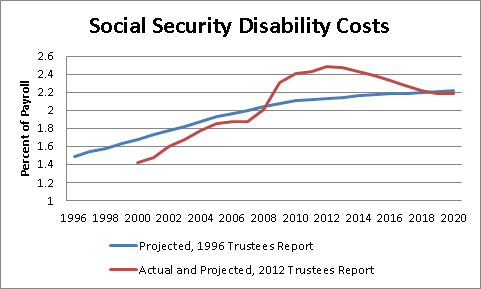
While there have been problems with the disability program for some time, these problems changed qualitatively as a result of the downturn. Disability payments actually had been somewhat below projections until the downturn. The downturn following the collapse of the housing bubble then sent costs soaring. The Trustees projections show that this rise is temporary and projected to fall back once the economy returns to something resembling full employment, as shown below.

Social Security Trustees Reports, 1996 and 2012.
You can get a somewhat fuller discussion of this point in my earlier blog post. Anyhow, before reporters just pick up the This American Life piece and start yapping about how disability costs have exploded out of control, they should take a moment and look at the projections in the Trustees report.
The reality is that the explosion in costs is just one more spin-off of the disastrous economic policy crafted in Washington. We have not suddenly become a nation of slackers or unemployable deadbeats.
Economists are used to talking about contagion, the idea that a financial crisis can spread from one country to another. Unfortunately it appears to be at least as serious a problem in news reporting.
Last week This American Life ran a full hour long segment on the Social Security disability program. While the piece was well-done and provided much useful information about the difficulties facing people on the program, it fundamentally misrepresented the economic context. The piece implied that the program has seen a sustained explosion in costs as displaced workers seek it out as a lifeline. This theme has now been picked up in a piece in The Atlantic.
While there have been problems with the disability program for some time, these problems changed qualitatively as a result of the downturn. Disability payments actually had been somewhat below projections until the downturn. The downturn following the collapse of the housing bubble then sent costs soaring. The Trustees projections show that this rise is temporary and projected to fall back once the economy returns to something resembling full employment, as shown below.

Social Security Trustees Reports, 1996 and 2012.
You can get a somewhat fuller discussion of this point in my earlier blog post. Anyhow, before reporters just pick up the This American Life piece and start yapping about how disability costs have exploded out of control, they should take a moment and look at the projections in the Trustees report.
The reality is that the explosion in costs is just one more spin-off of the disastrous economic policy crafted in Washington. We have not suddenly become a nation of slackers or unemployable deadbeats.
Read More Leer más Join the discussion Participa en la discusión
Read More Leer más Join the discussion Participa en la discusión
Read More Leer más Join the discussion Participa en la discusión
Read More Leer más Join the discussion Participa en la discusión
Last week This American Life had a piece on the increase in the number of people on Social Security disability. While the segment had many interesting stories, and presented useful background, it got some of the basics wrong.
While the story did note the impact of the economic downturn on disability claims, it failed to recognize the actual importance of the economic collapse. Instead the piece turned to a variety of other explanations, for example citing the 1996 welfare reform bill.
If we go back to the projections in the 1996 Social Security trustees report, the disability program was projected to cost 1.93 percent of payroll in 2005. As it turned out, the program cost just 1.85 percent of payroll in 2005, about 4 percent less than the trustees had projected in 1996. The program’s cost did explode in the downturn, rising to 2.43 percent of payroll in 2011, with a projection of 2.48 percent of payroll for last year.

Social Security Trustees Reports, 1996 and 2012.
However the explanation for this increase seems pretty clear — the economy is down almost 9 million jobs from its trend growth path. People who would have otherwise been employed find themselves desperate for any means of support due to the inept economic policy that sank the economy. This is a simple explanation that doesn’t require examining the moral turpitude of beneficiaries or evidence of corrupt or negligent administrators. Fix the economy and you would remove much of the burden on the program. It is also striking that the projections in the 2012 Trustees Report show the costs again falling below the level projected in 1996 once the unemployment rate gets back down to a more normal level.
Of course that doesn’t mean the program was working perfectly before the economic collapse. There were undoubtedly many people getting disability payments who should not have been and also many people who were wrongly denied benefits. The system is grossly understaffed. As a result, many claims take way too long to be processed and often the wrong decision is made.
However, it seems more than a bit of a reach to explain expanding disability roles on some of the items covered in the segment. For example, the welfare reform bill was passed after the projections in the 1996 Trustees report were made. Yet, in 1996 the trustees still projected that disability would cost more a decade later than turned out to be the case. If welfare reform had the effect discussed in the segment, the error should have been in the other direction.
As we say here in the nation’s capitol, it’s the economy, stupid.
Last week This American Life had a piece on the increase in the number of people on Social Security disability. While the segment had many interesting stories, and presented useful background, it got some of the basics wrong.
While the story did note the impact of the economic downturn on disability claims, it failed to recognize the actual importance of the economic collapse. Instead the piece turned to a variety of other explanations, for example citing the 1996 welfare reform bill.
If we go back to the projections in the 1996 Social Security trustees report, the disability program was projected to cost 1.93 percent of payroll in 2005. As it turned out, the program cost just 1.85 percent of payroll in 2005, about 4 percent less than the trustees had projected in 1996. The program’s cost did explode in the downturn, rising to 2.43 percent of payroll in 2011, with a projection of 2.48 percent of payroll for last year.

Social Security Trustees Reports, 1996 and 2012.
However the explanation for this increase seems pretty clear — the economy is down almost 9 million jobs from its trend growth path. People who would have otherwise been employed find themselves desperate for any means of support due to the inept economic policy that sank the economy. This is a simple explanation that doesn’t require examining the moral turpitude of beneficiaries or evidence of corrupt or negligent administrators. Fix the economy and you would remove much of the burden on the program. It is also striking that the projections in the 2012 Trustees Report show the costs again falling below the level projected in 1996 once the unemployment rate gets back down to a more normal level.
Of course that doesn’t mean the program was working perfectly before the economic collapse. There were undoubtedly many people getting disability payments who should not have been and also many people who were wrongly denied benefits. The system is grossly understaffed. As a result, many claims take way too long to be processed and often the wrong decision is made.
However, it seems more than a bit of a reach to explain expanding disability roles on some of the items covered in the segment. For example, the welfare reform bill was passed after the projections in the 1996 Trustees report were made. Yet, in 1996 the trustees still projected that disability would cost more a decade later than turned out to be the case. If welfare reform had the effect discussed in the segment, the error should have been in the other direction.
As we say here in the nation’s capitol, it’s the economy, stupid.
Read More Leer más Join the discussion Participa en la discusión
