October 11, 2010
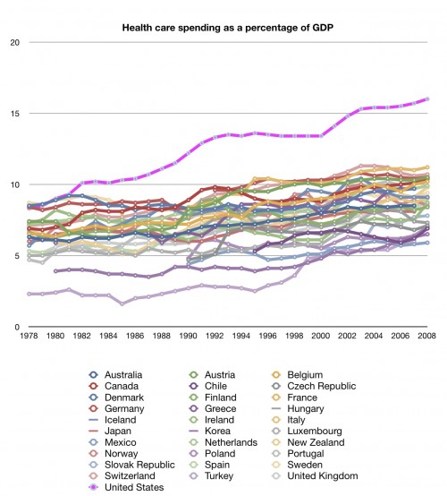
Aaron Carroll at The Incidental Economist has posted this very scary graph:
Health care spending as a share of GDP in the OECD
Click for Larger Image, Source: The Incidental Economist analysis of OECD data.
Back in the late 1970s, US health-care costs as a share of GDP looked a lot like those of the rest of the world’s rich democracies. At about 8 percent of GDP, US health-care expenditures were at the high-end, but still very much in the pack. Since then, health-care costs have crept up everywhere, but the United States has broken away away from the rest. We now spend about 16 percent of (a much larger) GDP.
In and of itself, spending more on health care is not a bad thing. But, we spend a lot more money and still manage to leave about 15 percent of our population with no health insurance and another important chunk with inadequate insurance (annual limits, life-time limits, treatment exclusions, poor coverage for preventive care) or conditional coverage (lose your job –say, because you’re sick– and you lose your coverage). All of the other rich countries on the list (Chile, Mexico, and Turkey are the exceptions, but not so rich) provide universal coverage. And it isn’t like we have dramatically better health outcomes –either compared to 30 years ago or to the other rich countries in the graph.
Interestingly, we are the only rich country that finances a majority of health-care in the private sector. The rest finance health care expenditures through universal government programs. In some countries, such as the United Kingdom, the government also directly provides care; but, in most, the government finances the care, which is then delivered primarily by the private sector, much like the US Medicare system. (Interestingly, since 1970, Medicare costs have increased one-third less than those of private insurers.)
This piece was cross-posted with John Schmitt’s blog, No Apparent Motive.


