November 02, 2010

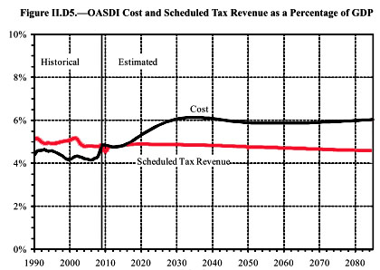
Kevin Drum at Mother Jones posts this graph, which he rightly calls: “The Most Important Social Security Chart Ever.” As Drum writes: “What’s important is that, unlike Medicare, Social Security costs don’t go upward to infinity. They go up through about 2030, as the baby boomers retire, and then level out forever. And the long-term difference between income and outgo is only about 1.5% of GDP. This is why I keep saying that Social Security is a very manageable problem.”
Coping with the Social Security shortfall is even easier than the chart suggests. In 2030, after adjusting for inflation, average income in the United States will be almost 50 percent higher than it is today (assuming a fairly modest two percent growth in real GDP per person); even if growth is painfully slow by historical standards (say, one percent per year), average incomes will be 20 percent higher in 2030 than they are today.
So, in 2030, when the gap between Social Security costs and revenues hits 1.5 percent of GDP, we’ll have to pay that 1.5 percent out of a much larger income than we have today. Even after making up the Social Security shortfall, future Americans will still be substantially richer than we are today.
(Of course, all of this analysis is “on average.” If we continue to grow as unequally as we have for the last 30 years, the typical worker might not be much better off in 2030 than he or she is today. But dealing with inequality is a separate issue, and cutting Social Security would only make inequality worse.)
This article originally appeared on John Schmitt’s blog, No Apparent Motive.