October 06, 2010

Neil Irwin posted a great set of graphs yesterday on the US “output gap” (the difference between the amount of goods and services the economy is actually producing and what the economy could be producing if it were operating at full capacity). He uses a nice interface to build a fairly complicated final image, starting from a simple line graph of the estimated “potential output” at full capacity:
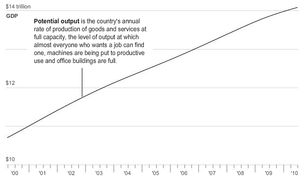
Source: Neil Irwin. (click for larger image)
then adding the actual level of output:
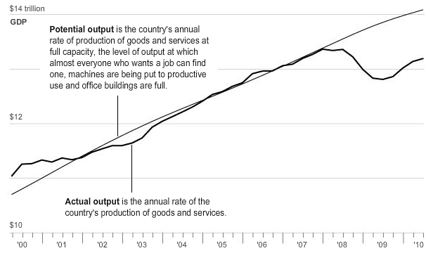
Source: Neil Irwin. (click for larger image)
and, eventually, the actual and potential output through 2020, under different growth scenarios:
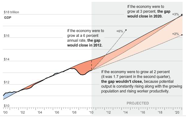
Source: Neil Irwin. (click for larger image)
One thing I like about the graphs is that they are high-tech, output-focused analogs of the series of employment-focused graphs that Tessa Conroy and I produced in the summer (earlier blog post here, full paper in pdf format here). Tessa and I also used a series of increasingly complicated graphs to build up to our punchline (which was, like Irwin, that anything short of very robust and sustained growth, starting soon, spells long-term trouble for the labor market). Irwin also makes excellent use of short text descriptions of key features in each graph, something that we didn’t do in our paper.
This piece was crossposted with John Schmitt’s blog, No Apparent Motive.