September 15, 2010

In an interview published Sunday, the US Treasury’s Chief Economist Alan Krueger told the Financial Times that: “The jobs situation – as difficult as it is – has actually started to improve earlier than in the last two recoveries.”
Today, Ezra Klein picked up on this same point, running with this graph from a post by Invictus at Ritholtz.com:
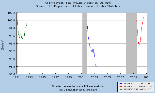
This first graph shows the change in total private-sector employment from the trough of the last three recessions (assuming that the Great Recession ended in the summer of 2009). By this measure, the last year or so doesn’t look so bad. Private employment turned around sharply about the beginning of this year, well ahead of the schedule for the previous two recessions.
But there are two problems here….
The first is that the Great Recession was a lot longer than the other two. That is why the gray area marking the recession is so much thicker in the late 2000s. In effect, the graph above doesn’t give the early 1990s or the early 2000s recessions any credit for being short –because all the employment data in the chart start after the recession is over.
The second problem is closely related: the chart above sets the post-recession private employment level equal to 100 and compares the recovery only to the absolute depths of the recession.
The chart below (also from Ritholtz.com, but not reproduced in Klein’s post) illustrates just how much of a buzz kill factoring in the length and depth of the Great Recession can be.
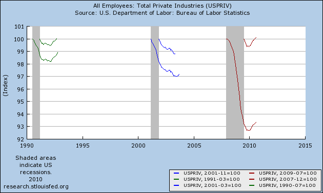
The top three lines are exactly the same as the ones in the first chart. The bottom three lines, however: (1) start tracking private employment from the beginning (not the end) of the recession and (2) use the employment level immediately before –not after– each recession as the benchmark (employment at the benchmark is set equal to 100).
There is just nothing to feel good about in that second graph.