November 28, 2012
The major media outlets did their best to ignore the housing bubble as it was growing to ever more dangerous levels. Incredibly, they still cannot recognize and understand the bubble even after its collapse sank the economy. Hence we get the Washington Post offering us 10 charts that explain “what is holding back the economy.”
Of course the Washington Post is a large corporation so they can waste money on unnecessary and misleading charts. Since CEPR is a small not-for-profit, we explain it all in one chart.

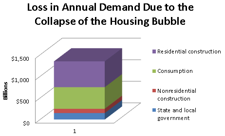
Source: Author’s calculations.
The basic story remains as simple as can possible be. We had a huge building boom that went bust. Instead of building houses at a near record pace, construction fell back to the lowest level in 50 years due to enormous oversupply. Similarly, the consumption boom that was driven by $8 trillion in bubble generated housing equity faded when that wealth disappeared.
The Post piece holds out the hope that underwater homeowners will increase annual consumption by $400-$500 billion when they get above water. That would imply around $40,000 a year in additional consumption from families with a median income of around $70,000. This is not the sort of stuff that deserves to be taken seriously. It’s also important to remember that the ratio of consumption to disposable income is unusually high, not low.
The other items on my chart are the falloff in non-residential construction following the collapse of the bubble in that sector and the drop-off in state and local government spending that resulted from the loss of property taxes and other revenue following the collapse of the bubble.
This single chart very simply tells the story of the housing bubble. If the Post needs make work projects they can always have people make up charts for no reason, but it would be better if they didn’t include them in the newspaper. It might confuse readers.


Comments