

December 04, 2012

Paul Krugman’s columns and blogs are a great source of insight on the economy and the budget, but he does occasionally make mistakes. He is guilty of one today, when he used a very misleading graph on the sources of the budget deficits in his blog.

There are two major problems with the graph. First, it begins in 2009. This might lead readers to believe that large budget deficits had been an ongoing problem. That is not true. The deficit was just 1.2 percent of GDP in 2007 and was projected to remain low until the collapse of the housing market sent the economy plummeting in 2008.
The other problem is that it shows the deficit in nominal dollars rather than as a share of GDP. This conceals the fact that the deficit was projected to be about half as large as a share of GDP in 2019 as it was in 2009. While the deficit projected for 2019 would still be too large to sustain indefinitely, by not expressing the deficit relative to the size of the economy, readers are likely to exaggerate the extent of the problem it would pose.
A graph that gives a better picture of the problem of the budget deficit in relation to the economy would look like the one below. The point is that the collapse of the economy gave us large deficits. Even with the wars and the Bush tax cuts to the rich, the deficits would still have been manageable had the economy not collapsed.
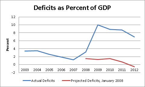 Source: Congressional Budget Office.


Comments