October 02, 2015
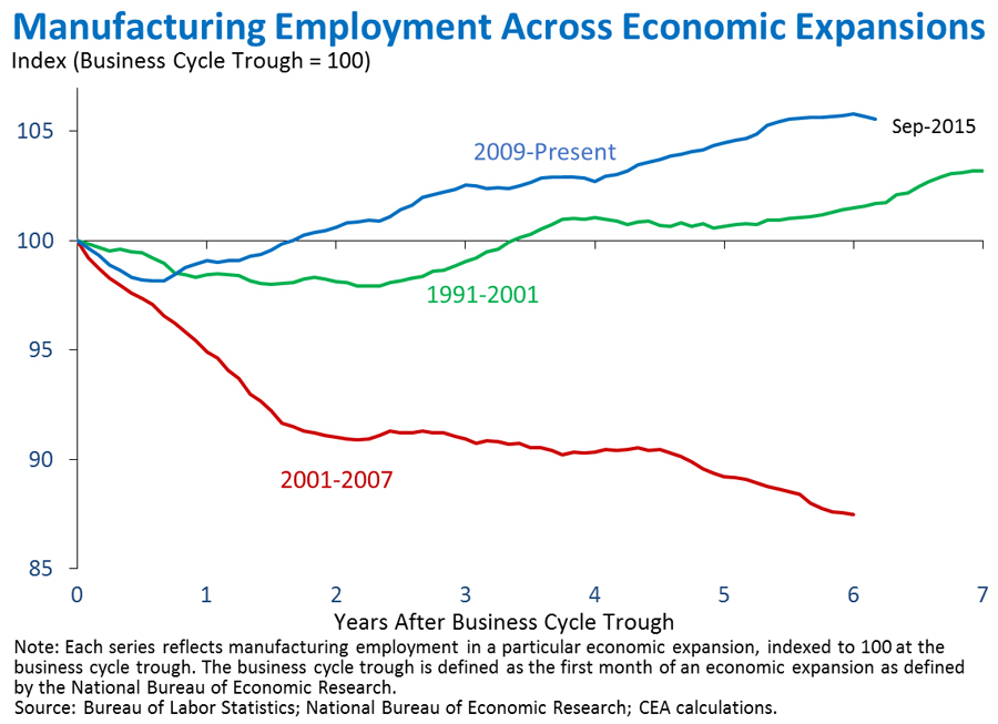
Over at the White House blog, Council of Economic Advisers Chairman Jason Furman posted an interesting graph on the latest job numbers. It depicts manufacturing employment, with the number of jobs indexed to 100 during the last month for each of three different recessions:

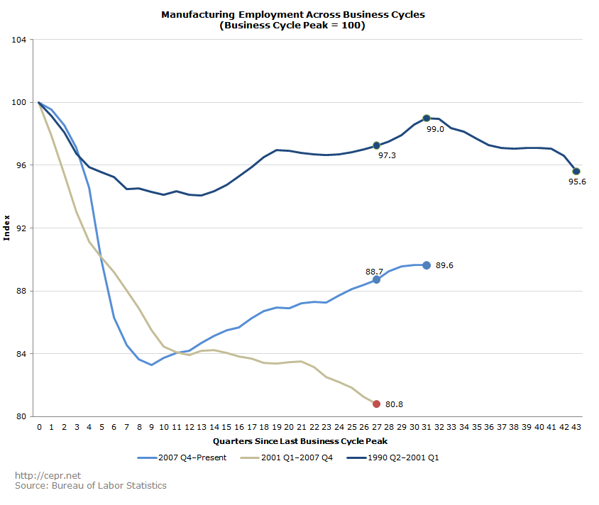
Looking at the graph, you’d think that manufacturing employment has rebounded more strongly from the 2007–2009 recession than from the 1990–1991 and 2001 recessions. This isn’t completely true. Normally economists measure job growth not from business cycle trough to business cycle peak, but rather from one peak to the next. This is done for two reasons. First, economies typically experience strong growth after the end of a recession, with growth being greater when economies have experienced more severe recessions. For the graph above, employment growth should be greatest after the 2007–2009 recession, since that was the most severe of the three recessions depicted. Second, starting from a business cycle peak allows us to see how the jobs gained since the recession compare with the jobs lost during the recession. If we re-do the graph above with manufacturing employment indexed to 100 for each business cycle peak, we get a far different result from the one shown by Furman:

Furman stated in the blog: “The 1991–2001 expansion did see manufacturing employment growth, but at a considerably slower pace” than after the 2009 expansion. This may leave readers with the impression that manufacturing has recovered to a greater degree from the 2007–2009 recession than after the 1990–1991 recession. Furman’s statement accounts for months of job gain but discounts many months of job loss. When we factor lost jobs into the equation, recovery from the 2007–2009 recession actually appears sub-par.


