Today’s target is the usually astute Ryan Avent. Writing in the Economist, Ryan tells readers:
“Two rich economies, relatively similar in structure, reacted very differently to the global financial shock of late 2008. In America output sank sharply but then rebounded to new highs. Employment, by contrast, fell dramatically and has recovered much more slowly; it has yet to regain the pre-crisis peak. In Britain the trends were reversed; employment is setting new highs while output suffered an L-shaped recovery.”
The piece goes on to explain that because of a drop in real wages, firms in the U.K. hired more workers. By contrast, in the U.S. firms went the route of adopting productivity enhancing technology.
The problem with this story is that employment has actually followed a similar path in the U.K. and the U.S. in the upturn. According to OECD data, in the U.K. between 2010 and the third quarter of 2013, the employment to population ratio for workers between the ages of 16 to 64 rose from 69.5 percent in 2010 to 70.8 percent. That’s a rise of 1.3 percentage points. By contrast, in the U.S. the increase was from 69.7 percent to 70.4 percent, a rise of 0.7 percentage points.
While 1.3 percentage points is more than 0.7 percentage points, it doesn’t describe a qualitatively different situation. Furthermore, the gap would largely disappear if we looked at hours worked. The OECD data shows the average number of hours per worker increasing by 0.6 percent in the U.S. between 2010 and 2012 compared to a rise of just 0.1 percent in the UK. In other words, the story that firms in the U.K. are turning to hiring labor because it is cheaper simply is not true. The labor might be cheaper, but isn’t lead to more hiring.
I actually think there is a great deal to Ryan’s larger point, that productivity is to a large extent a response to wages. In the U.S. we have lots of low productivity jobs that exist because people are desperate for work, such as the midnight shift at convenience stores. If wages were higher, these jobs would disappear, leading to a rise in productivity. So the story is reasonable, it just doesn’t apply to the situation being examined.
Since I am on the topic of explaining things that didn’t happen, I will turn to my favorite, the weak consumption in the wake of the downturn. We have had endless tracks explaining why people are not spending as much in the recovery as they did before the downturn. Most of this centers on debt overhangs and the like. I would hate to destroy so much job creating potential for economists, but it is worth pointing out that people actually are spending.
Here’s the simple story, the saving rate is actually relatively low right now, which means that consumption is relatively high.
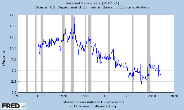
The current saving rate is near 4.0 percent. That’s higher than the lows hit at the peaks of housing bubble in the last decade or the stock bubble in the 1990s, but it is considerably lower than the averages for the 1960s, 1970s, 1980s, and even the 1990s.
This means that people are actually spending an unusually high share of their income. They are not spending as high a share of they did in 1999-2000 or 2004-2007, but that’s because they had trillions of dollars of bubble generated wealth in those years. The concept of a wealth effect, whereby people spend based in part on their wealth, goes back at least 80 years, so economists should be familiar with it.
Anyhow, just because there is no falloff in consumption doesn’t mean lots of economists can’t devote their time to explaining it. After all, what else do they have to do?
Today’s target is the usually astute Ryan Avent. Writing in the Economist, Ryan tells readers:
“Two rich economies, relatively similar in structure, reacted very differently to the global financial shock of late 2008. In America output sank sharply but then rebounded to new highs. Employment, by contrast, fell dramatically and has recovered much more slowly; it has yet to regain the pre-crisis peak. In Britain the trends were reversed; employment is setting new highs while output suffered an L-shaped recovery.”
The piece goes on to explain that because of a drop in real wages, firms in the U.K. hired more workers. By contrast, in the U.S. firms went the route of adopting productivity enhancing technology.
The problem with this story is that employment has actually followed a similar path in the U.K. and the U.S. in the upturn. According to OECD data, in the U.K. between 2010 and the third quarter of 2013, the employment to population ratio for workers between the ages of 16 to 64 rose from 69.5 percent in 2010 to 70.8 percent. That’s a rise of 1.3 percentage points. By contrast, in the U.S. the increase was from 69.7 percent to 70.4 percent, a rise of 0.7 percentage points.
While 1.3 percentage points is more than 0.7 percentage points, it doesn’t describe a qualitatively different situation. Furthermore, the gap would largely disappear if we looked at hours worked. The OECD data shows the average number of hours per worker increasing by 0.6 percent in the U.S. between 2010 and 2012 compared to a rise of just 0.1 percent in the UK. In other words, the story that firms in the U.K. are turning to hiring labor because it is cheaper simply is not true. The labor might be cheaper, but isn’t lead to more hiring.
I actually think there is a great deal to Ryan’s larger point, that productivity is to a large extent a response to wages. In the U.S. we have lots of low productivity jobs that exist because people are desperate for work, such as the midnight shift at convenience stores. If wages were higher, these jobs would disappear, leading to a rise in productivity. So the story is reasonable, it just doesn’t apply to the situation being examined.
Since I am on the topic of explaining things that didn’t happen, I will turn to my favorite, the weak consumption in the wake of the downturn. We have had endless tracks explaining why people are not spending as much in the recovery as they did before the downturn. Most of this centers on debt overhangs and the like. I would hate to destroy so much job creating potential for economists, but it is worth pointing out that people actually are spending.
Here’s the simple story, the saving rate is actually relatively low right now, which means that consumption is relatively high.
The current saving rate is near 4.0 percent. That’s higher than the lows hit at the peaks of housing bubble in the last decade or the stock bubble in the 1990s, but it is considerably lower than the averages for the 1960s, 1970s, 1980s, and even the 1990s.
This means that people are actually spending an unusually high share of their income. They are not spending as high a share of they did in 1999-2000 or 2004-2007, but that’s because they had trillions of dollars of bubble generated wealth in those years. The concept of a wealth effect, whereby people spend based in part on their wealth, goes back at least 80 years, so economists should be familiar with it.
Anyhow, just because there is no falloff in consumption doesn’t mean lots of economists can’t devote their time to explaining it. After all, what else do they have to do?
Read More Leer más Join the discussion Participa en la discusión
The NYT had an article discussing a release of data on household debt by the NY Fed. The article noted that debt rose rapidly and highlighted the increase in mortgage debt in the fourth quarter, the first since before the downturn.
Actually, the main reason that mortgage debt increased in the fourth quarter, as compared to declines in prior quarters, was due to a lower rate of write-downs of bad debt. There was no surge in new mortgage debt in the fourth quarter.
Read More Leer más Join the discussion Participa en la discusión
The Washington Post had a somewhat confused front page piece claiming that student debt burdens are a major obstacle to the recovery of the housing market. First, it should be noted that by most measures the housing market has already recovered. Prices are above their trend levels. Sales are also at or above trend levels. Construction has not yet recovered, but this will not happen until the inventory of vacant housing units is further reduced.
However, the piece is seriously misleading in implying that student loan debt is a main factor impeding home buying. (Bizarrely, it discusses the situation of someone looking to buy an $800,000 home, four times the median house price.) While student loan debt undoubtedly does make it more difficult for people to buy homes, so do low wages. This is a much bigger problem for people without college degrees who have historically accounted for the vast majority of homeowners.
According to a recent study by Pew, the median 25-32 year-old with an associate degree earned $30,000 in 2012. Those with only a high school degree earned $28,000. Both are less in real terms than what they would have earned in 1979. If we assume that their mortgage payments and taxes should not exceed 30 percent of their gross income, this means that they cannot afford a house that costs more than $153,500, roughly 75 percent of the median house price. This assumes a 4.5 percent interest rate, a 20 percent down payment, and no need for mortgage insurance. If this were to rise to 5.5 percent, either due to higher interest rates or a need to get mortgage insurance, then they would only be able to afford a home costing $139,500.
The study showed the median high school grad earned $28,000, which means that in these cases the most expensive house they could afford would be $143,300 in the case of a 4.5 percent interest rate and $130,200 in the case of 5.5 percent interest rate. As a result, most young people without college degrees will not be earning enough money to buy a house. It is worth noting that the Pew study showed that the median wage of college grads has barely risen for the typical college grad over the last three decades also. They have also been victims of the upward redistribution during this period, although not quite to the same extent as those with less education.
Read More Leer más Join the discussion Participa en la discusión
It’s baaaaaaaaaaaaack! Those silly warnings about the menace of deflation, this time in a NYT editorial. Come on folks, this one is really simple; the problem of deflation is an inflation rate that it is too low. Even an economist can figure this one out.
When you have near zero inflation many prices are already falling. What’s the difference if the price of 55 percent of goods and services are declining instead of 45 percent? Besides these are all quality adjusted prices, so in many cases the actual purchase price of most items might be rising even in a period of deflation.
This matters because it leads people to believe that keeping the inflation rate above zero is somehow an accomplishment, with things getting bad only if the aggregate figure goes negative. This is not true, there is no magic to zero. The problem in the euro zone and in the United States is that inflation is too low. If it goes negative then it will be an even bigger problem, but that is only because it will be a lower inflation rate, crossing zero means nothing.
Read More Leer más Join the discussion Participa en la discusión
It’s amazing what some folks will say to promote trade agreements. Today, John Harwood in the NYT gave us the theory of immaculate trade pact conception. In this view trade pacts are negotiated by members of the high priesthood who focus on promoting the overall national interest and economic growth. Unfortunately, these pacts must deal with the evils of everyday politics.
In this respect he tells of the urgent need for fast-track (a.k.a. “trade promotion”) trade authority:
“Presidents value the Trade Promotion Authority because it forces Congress to vote up or down on trade deals, shielding them from House and Senate amendments at the behest of corporations, unions, environmental groups or other interests.”
In reality these deals were being negotiated by corporate interests from day one. The U.S. trade negotiators are working hand in hand in with the pharmaceutical industry, the software industry, the financial industry, the oil and gas industry, and other major corporate interest groups to craft a deal that will increase their profits. Economic growth has nothing to do with it. Even the models used to tout the benefits of these deals show gains that are too small to be measured in annual GDP data. And these growth estimates don’t even take account of the negative impact that stronger patent and copyright monopolies, and the resulting prices increases, would have on growth. The idea that these trade deals are about promoting growth is a story for little kids and reporters at major news outlets.
Of course it is possible to craft a trade deal that would promote real economic gains. Doctors in the United States earn salaries that are hugely out of line with those in other wealthy countries. The same is true for other highly paid professions. If a trade deal focused on reducing the barriers that prevent these professionals from providing their services in the United States the gains would be substantial. The savings on doctors alone could be close to $100 billion a year (0.6 percent of GDP).
The agreements could also focus on reducing the value of the dollar, which would make our goods and services more competitive internationally. This would lower our trade deficit and potentially create millions of jobs. And, we could reduce patent and copyright barriers, lowering prices and making markets more competitive.
But these items don’t come up at trade negotiations because the folks at the table would lose from these growth enhancing measures. Instead we get silly stories about trade pacts being negotiated by disinterested parties who are only looking out for the good of the country. Come on folks, you’ve got to do better than this.
Read More Leer más Join the discussion Participa en la discusión
It must be great to be a columnist for the Washington Post. You get to rewrite the same columns week after week. You never have to pay attention to facts and data or even make sure that you accurately present the arguments you criticize. Hence we have Robert Samuelson telling us this morning that “economists are in the dark.”
Of course he is in large part right. Given its colossal failure in recognizing the risks of the housing bubble it would be reasonable for every university to shut down its economics program, recognizing that it has about as much use as a department of astrology. But Samuelson is shooting blanks when he tells us that Keynesian economics has been proven a failure by the downturn.
“This conclusion is surely controversial because many economists attribute the weak recovery to misguided austerity, especially in Europe. Just follow the advice of John Maynard Keynes (1883-1946), they say. When the economy suffers a massive drop in private spending, government should offset the loss by increasing its budget deficits. Europe’s budget cuts were too aggressive, they say, while U.S. ‘stimulus’ policies were not aggressive enough.
“Perhaps history will vindicate this appeal to Keynesianism. Or perhaps not. The fact is that the United States did respond aggressively under both George W. Bush and Barack Obama. It certainly didn’t embrace austerity. Federal budgets ran massive deficits — $6.2 trillion worth from 2008 to 2013, averaging 6.4 percent of the economy (gross domestic product). Nothing like this had occurred since World War?II. Yet, the economy limped along. Why wasn’t this enough?”
Yes, well we have to keep Robert Samuelson away from the really big numbers, he might hurt himself. The reason it wasn’t enough is because the shortfall in demand created by the collapse of the housing bubble was even bigger, as some of us yelled at the time. The loss in residential construction was around 4 percentage points of GDP. The loss in consumption due to the loss of housing bubble generated wealth was also around 4 percentage points of GDP. Throw in another 1 percentage point each for the reduction in state and local government spending and non-residential construction and you’re up to 10 percentage points of GDP; that comes to almost 1.7 trillion in today’s economy.
If we sum that over 6 years we get more than $10 trillion and that’s before even factoring in any multiplier effects. So, $6.2 trillion is a really big number, but the actual shortfall in demand created by the collapse of the housing bubble was an even bigger number. And those of us who pay attention to the economy were saying this as loudly and clearly as we could at the time.
There is no problem with understanding the economy and figuring out how to turn it around. The problem is that the debate is dominated by people like Robert Samuelson who refuse to look seriously at the data and to listen to what the people he criticizes are saying.
Read More Leer más Join the discussion Participa en la discusión
Unfortunately he is wrong about the direction of change. Apparently Summers has missed the downturn in the last six years and the weak growth since the turn of the century. In his post column today he warns readers:
“If total income were independent of efforts at redistribution, there would be a compelling case for reducing incomes at the top and transferring the proceeds to those in the middle and at the bottom. Unfortunately, this is not the case. It is easy to conceive of policies that would have reduced the earning power of a Bill Gates or a Mark Zuckerberg by making it more difficult to start, grow and globalize businesses. But it is much harder to see how such policies would raise the incomes of the remaining 99.9?percent of the population, and such policies would surely hurt them as consumers.”
It’s interesting Summers picked Bill Gates. Back in the early 1990s Microsoft helped to lock in its monopoly on operating systems by contracting with major manufacturers so that they paid Microsoft for each computer they shipped that had a competitors’ operating system. Needless to say, such deals strongly discouraged Dell, Hewlett-Packard and other major manufacturers from experimenting with niche operating systems that might have potentially had larger uses. Had the Justice Department taken anti-trust law seriously we might have better software today and Bill Gates would be considerably less wealthy.
We could also impose a modest sales tax on financial transactions as even the I.M.F. has advocated. This would both hit many of the fortunes being collected on Wall Street and also reduce the enormous amount of waste in a financial system that consumes five times as large a share of GDP as it did forty years ago.
We could cut back on the fortunes in the pharmaceutical industry and tech sector and get better drugs and technology by moving away from patent supported research. (Yes, there is such a thing as the National Institutes of Health and everyone agrees it does great work.) We could also make it more difficult to bring frivolous patent suits so that Apple, Samsung and the rest will have to compete to make the best products, not in the court rooms.
And we could cut back on the Walton family’s fortunes by pushing China and other developing countries to raise the value of their currencies. This would reduce their profit margins on low cost imports. It would also have the great advantage of moving us toward more balanced trade creating millions of jobs and increasing growth. In addition, by getting us closer to full employment, tens of millions of workers would be in a position to get wage gains.
So Summers is absolutely right. Total income is not independent of distribution and many of the steps we might want to take to equalize distribution would also foster growth.
Read More Leer más Join the discussion Participa en la discusión
Thomas Friedman is loose in Silicon Valley, the economic hub best known for colluding to rip off its workers. He can’t contain his enthusiasm for “start-up America,” telling readers;
“What they all have in common is they wake up every day and ask: ‘What are the biggest trends in the world, and how do I best invent/reinvent my business to thrive from them?’ They’re fixated on creating abundance, not redividing scarcity, and they respect no limits on imagination. No idea here is ‘off the table.'”
Yeah, it must have taken some brilliant Silicon Valley imagination for Apple to sue Samsung to get its competitor’s cell phones off the market. In places that are behind the curve they would think that they have to produce a better cell phone, but in Silicon Valley they have the government just remove their competitor’s products from the shelves. See, no idea is off the table.
Okay, but that’s just cheap fun. The real story here is that Friedman is calling out Washington for not supporting the trade deals the corporations love. Just to be clear, Friedman makes no pretense of evaluating trade deals based on evidence. In fact, he boldly proclaimed the opposite:
“I was speaking out in Minnesota — my hometown, in fact — and a guy stood up in the audience, said, ‘Mr. Friedman, is there any free trade agreement you’d oppose?’ I said, ‘No, absolutely not.’ I said, ‘You know what, sir? I wrote a column supporting the CAFTA, the Caribbean Free Trade initiative. I didn’t even know what was in it. I just knew two words: free trade.'”
Given his religious devotion to pacts labeled “free-trade” agreements, it is hardly surprising that Friedman would strongly support the Trans-Pacific Partnership (TPP) and the Trans-Atlantic Trade and Investment Pact (TTIP). He begins by calling them “next generation” trade agreements:
“that even the playing field for us by requiring higher environmental and labor standards from our trading partners and more access for our software and services.”
That’s a great story. Obviously he hasn’t heard about the leaked environmental chapter of the TPP that is universally recognized as a joke. No one, other than perhaps Thomas Friedman, thinks the labor chapter will be any more serious.
Then Friedman quotes the Economist:
“Studies suggest that proposed deals with Asia and Europe could generate global gains of $600 billion a year, with $200 billion of that going to America,”
His keepers were supposed to keep Friedman away from big numbers. Does Friedman think these numbers are for next year, ten years out, twenty years out? He doesn’t tell us and probably doesn’t have a clue himself. Hey, the world is flat, everyone is hyper-connected, why does it matter?
For those who actually like their numbers to mean something, these projections are for somewhere around the middle of the next decade when world GDP will be around $160 trillion and U.S. GDP will be close to $30 trillion. That puts the projected gains at a bit less than 0.4 percent of world GDP and 0.7 percent of U.S. GDP. That’s not trivial, but hardly the difference between booming growth and a stagnant economy. In the case of the U.S. the boost to growth would be around 0.05 percentage points.
While Friedman insists these numbers are too low, the opposite is almost certainly true. These deals are focused to a substantial extent on increasing patent and copyright type protections. These government granted monopolies, restrict competition and raise prices. (This is likely to be an especially big issue in the case of prescription drugs.) The studies that show gains from these trade agreements don’t make any effort to incorporate the higher prices that result from these protections.
These monopolies will be a drag on growth and will quite likely more than offset any projected gains from the trade liberalization portions of the deals. They also have the effect of redistributing income upward. That is why serious people have serious reservations about the TPP and the TTIP.
But such issues don’t trouble Thomas Friedman, after all he “just knew two words: free trade.”
Note: Typos corrected, thanks Fairleft and Robert Salzberg.
Read More Leer más Join the discussion Participa en la discusión
I’m not kidding. They discuss the battle between the progressive and the Wall Street wings of the Democratic Party then tell readers;
“For Democrats who could lead the party in the future, the challenge will be to articulate a new populist direction without denigrating the Obama record or abandoning the contributions of Bill Clinton.”
Of course the most important contribution of Bill Clinton was an over-valued dollar that led to a huge trade deficit. The demand gap that was created by the trade deficit (this is income that creates demand overseas rather than the United States) was filled by the stock bubble in the 1990s and the housing bubble in the last decade. The fallout from the collapse of these bubbles has been disastrous. In the case of the housing bubble, the changes in Congressional Budget Office projections from before the collapse to the present imply a cost to the country of $24 trillion ($80,000 per person) in lost output through 2024.
One might think this would be grounds to abandon the Clinton legacy, but hey, Balz and Rucker say they better not.
Read More Leer más Join the discussion Participa en la discusión
Joe Nocera uses his column today to discuss the scary robot story. This is the story that none of us will have jobs because we will all be displaced by robots. (Incredibly, this story exists side by side with its direct opposite, the view that we won’t have any workers because so many people are retiring and living forever.) Anyhow, the deal is that the owners of the robots are very rich and the rest of us are left begging for pennies.
The reason this story makes no sense is that the ability to get rich from owning robots will not depend on physically owning a robot. Robots will be cheap to produce; they will be made by other robots. If robots are expensive it will be because we give strong and long patent monopolies.
Without strong patent protection we will all be able to buy robots for a few dollars that will cook our food, clean our homes, install cheap solar panels and insulation, provide us medical care, grow our vegetables, and teach our children. How could we be poor in this world?
In short, the scary story is a story of patent policy designed to redistribute income upward. It has nothing to do with technology.
Read More Leer más Join the discussion Participa en la discusión