

February 28, 2013

I know it’s rude to bring numbers to DC policy debates, but some of us uncouth types just can’t control ourselves. Just for fun, I thought I would see what government spending measured as a share of GDP would look like if the economy had grown as had been projected before the 2008 collapse.
This is similar to taking the deficits as a share of potential GDP, but not exactly the same. Potential GDP is based on the Congressional Budget Office’s (CBO) estimate of the economy’s potential level of output. I am looking at the levels of GDP that CBO projected back in January of 2008 (Table 2-1), before it recognized the impact that the collapse of the housing bubble would have on the economy.
The estimate of potential GDP will differ for three reasons. First CBO may just be wrong about the economy’s potential, it could be higher or lower than the level they estimate. Second, potential GDP may be lower as a result of economic developments over the last five years. For example, the large number of workers who have experienced long periods of unemployment may have effectively reduced the size of our potential labor force as some have lost skills. Third, CBO may just have been out to lunch when they made their projections in 2008.
In any case, this is still a useful exercise. It gives a chance to see the extent to which the ratio of spending to GDP has increased as a result of the fact that we are spending more than we had in 2007 relative to the size of the economy as opposed to the fact that the economy did not grow as much as we expected. Here’s the picture:
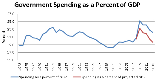
Source: CBO and author’s calculations.
CBO projects that spending will be 22.8 percent of GDP in fiscal 2013 (this includes the effects of the sequester). That puts spending above the average of the last four decades, but below the peaks reached in the Reagan years. However, if the economy had grown at the rate that was projected in 2008, the current year’s spending would be just 19.6 percent of GDP. That puts 2013 spending well below the 20.7 percent of GDP average for the years from 1973-2007. That is especially striking since we know that Medicare and Social Security have grown substantially as a share GDP due to the aging of the population.
So where is the runaway spending? Oh well, this is Washington. Let’s get back to the sequester.


Comments