September 19, 2011
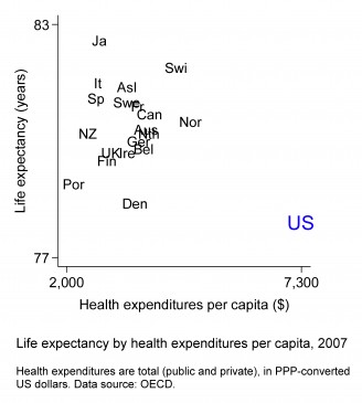
Lane Kenworthy has posted two extremely helpful graphs that try to gauge the efficiency of the US health-care system relative to those of other wealthy countries. The first shows life expectancy in each country, in 2007, against per-capita health expenditures in the same year.
The United States is a huge outlier. We spend the most –by far– and yet we also have the lowest life expectancy.
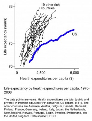
But, as Kenworthy notes, the US could be an outlier for reasons that don’t have to do with the efficiency of our health-care system. Our life expectancy might be lower because we have a much higher murder rate or a much higher incidence of obesity, for example. So, he offers a second graph that, for the same group of countries, traces out the relationship over time between life expectancy and per-capita health expenditures. In this graph, we can see to what extent additional health expenditures help to reduce life expectancy within each country.
The United States is still a substantial outlier. In every other country in the sample, extra health-care spending is associated with much higher increases in life expectancy than we see in the United States.
Neither graph proves causality, but both –and especially the second graph– suggest that the US health-care system is expensive and inefficient relative to the systems in place in other rich countries.
This post originally appeared on John Schmitt’s blog, No Apparent Motive.


