February 07, 2015
Okay, we’ll try it with pictures this time. I have been trying to explain that the monthly wage data are erratic. If we accept the numbers at face value then we would have to believe that workers go from getting healthy pay gains one month to pay cuts the next. To me that seems pretty implausible, but apparently many reporters and some economists think this is the way the economy works.
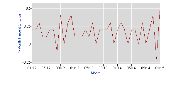
So today we do it with pictures. The folks who believe that the monthly wage data released by the Labor Department are giving us real insight into the movement in wages think that monthly wage changes look like this.
Percent Change in Average Hourly Wage

Source; Bureau of Labor Statistics.
That doesn’t look like the economy I see, but hey, what do I know?


Comments